1. Introduction
![]()
本笔记是 DataWhale 第 33 期
Fantastic-Matplotlib 项目的学习笔记。原项目地址:Clike
here。本博客提供笔记所使用的数据:
Matplotlib 是 python
数据可视化最重要且常见的工具之一,和数据打交道的过程中几乎都不可避免要用到,此外也有大量的可视化工具是基于
matplotlib 做的二次开发。它是一个 Python 2D
绘图库,能够以多种硬拷贝格式和跨平台的交互式环境生成出版物质量的图形,用来绘制各种静态,动态,交互式的图表。
通常,在用 python 做数据可视化时面临两大痛点:
- 没有系统梳理
matplotlib的绘图接口,常常是现用现查,用过即忘,效率极低; - 没有深入理解
matplotlib的设计框架,往往是只会复制粘贴,不知其所以然,面对复杂图表时一筹莫展;
基于此,本项目将从 官方文档
出发,系统的阐述 Matplotlib 的常见用法。
2. Begin with a simple case
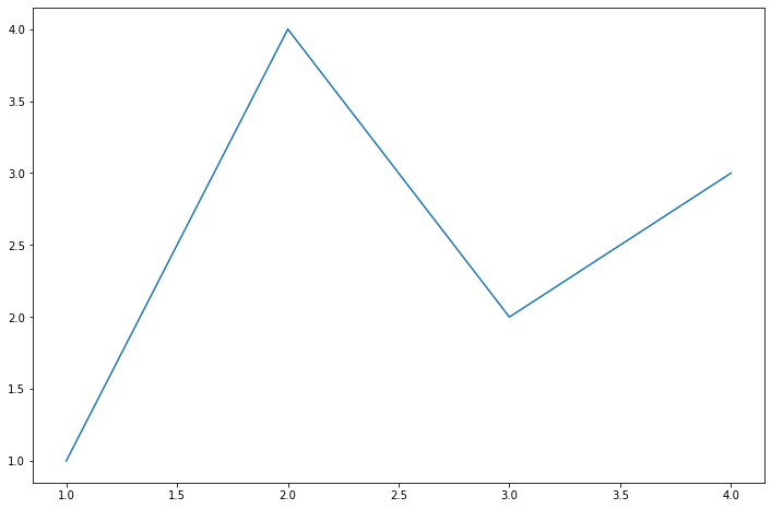
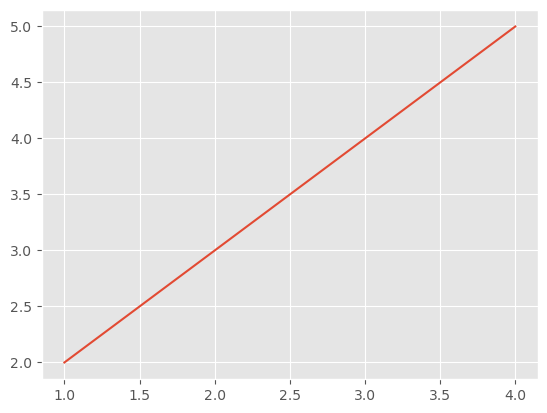
2.1 Create figure
Matplotlib 的图像是画在 figure (如
windows, jupyter 窗体)上的,每一个
figure 又包含了一个或多个
axes(一个可以制定坐标系的子区间)。最贱的创建
figure 以及 axes 的方式是通过
pyplot.subplots 命令,之后可以使用 Axes.plot
绘制最简易的折线图。
Import module
1
2
3
import matplotlib.pyplot as plt
import matplotlib as mpl
import numpy as npNote: 有时,当我们在
matplotlib中使用中文时,我们会发现乱码或者无法正常显示的情况,这是因为默认的字体不支持中文字体,可以在导入模块之后使用下述代码来自定义中文字体。1
2
3
4
5
6
7
8from pyplt import mpl
mpl.rcParams['font.sans-serif'] = ['SimHei']
mpl.rcParams['axes.unicode_minus'] = False
# 或
import matplotlib.pyplot as plt
plt.rcParams['font.sans-serif'] = ['SimHei']
plt.rcParams['axes.unicode_minus'] = FalsePlot
1
2fig, ax = plt.subplots()
ax.plot([1, 2, 3, 4], [1, 4, 2, 3])Results:
Components
创建了
figure之后,我们来深入理解一下一张figure的组成。通过一张figure的解剖图,我们可以看到一个完整的matplotlib图像通常会包括四个层级,这些层级也被称为容器container,下一章会对其进行详细介绍。在了解了容器之后,我们可以通过各种命令方式来操作图像中的每个部分,从而达到自定义数据可视化的效果。Figure:顶层级,用来容纳所有绘图元素;Axes:Matplotlib宇宙的核心,容纳了大量元素;用来构造一幅幅子图,一个figure可以由一个或多个子图组成;Axis:Axes的下属层级,用于处理所有与纵坐标、网格有关的元素;Tick:Axis的下属层级,用来处理所有和刻度有关的元素。

2.2 Interfaces
Matplotlib
提供了两种最常用的绘图接口,面向对象编程绘图和函数式绘图。面向对象
(Object-oriented,
OO)绘图更加灵活,现实中,在添加文本注释时,常使用
OO,在 Axes
找到对应的位置,直接添加文字,在考虑多张表不规则排放在一张图中时,尤其时嵌套等情况,也会使用
Axes
来规定位置。但是,函数式绘图更加方便与快速,两者结合都掌握才能更好地画出想要的图。
Reference: Matplotlib入门(一)
2.2.1 面向对象编程绘图
面向对象 (Object-oriented,
OO)绘图灵活,当我们要更改坐标轴相关属性时会倾向于使用面向对象编程绘图,如:
1 | x = np.linspace(0, 2, 100) |
Results:
2.2.2 函数式绘图
函数式绘图则相对而言更便捷:
1 | x = np.linspace(0, 2, 100) |
Results:
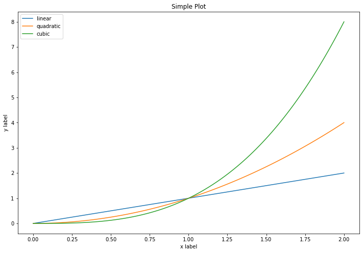
2.3 General plot template
由于 Matplotlib
绘图的知识十分庞杂,在实际使用过程中,不可能将全部的 API
都记住。大部分时候都是边用边查。因此若想精通 Matplotlib
绘图的话,建议养成记笔记的良好习惯,每次绘图时都可以从自己的笔记库中摘抄相应的功能,类似于本人的博客:Matplotlib。由于里面记录许多图表类型,因此可以基本满足日常绘图的需求。
此处,就绘图的步骤提供一个通用绘图模板,初学者刚开始学习时只需要牢记这一模板就足以应对大部分简单图表的绘制,在学习过程中可以将这个模板模块化,了解每个模块在做什么,在绘制复杂图表时如何修改,填充对应的模块。
Steps:
Prepare data
1
2x = np.linspace(0, 2, 100) # Create 100 numbers
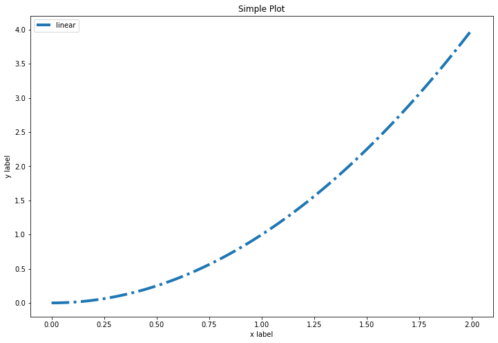
y = x ** 2Style set
设置绘图样式,这一模块的扩展参考第六章进一步学习,这一步不是必须的,样式也可以在绘制图像是进行设置。
1
mpl.rc('lines', linewidth=4, linestyle='-.')
Define layout
定义布局, 这一模块的扩展参考第三章进一步学习
1
fig, ax = plt.subplots()
Plot
绘制图像, 这一模块的扩展参考第二章进一步学习
1
ax.plot(x, y, label='linear')
Tag
添加标签,文字和图例,这一模块的扩展参考第四章进一步学习
1
2
3
4ax.set_xlabel('x label')
ax.set_ylabel('y label')
ax.set_title("Simple Plot")
ax.legend()
Full code:
1
2
3
4
5
6
7
8
9
10
11
12
13
14
15
16
17
18# step1 准备数据
x = np.linspace(0, 2, 100)
y = x**2
# step2 设置绘图样式
mpl.rc('lines', linewidth=4, linestyle='-.')
# step3 定义布局, 这一模块的扩展参考第三章进一步学习
fig, ax = plt.subplots()
# step4 绘制图像
ax.plot(x, y, label='linear')
# step5 添加标签
ax.set_xlabel('x label')
ax.set_ylabel('y label')
ax.set_title("Simple Plot")
ax.legend()Results:
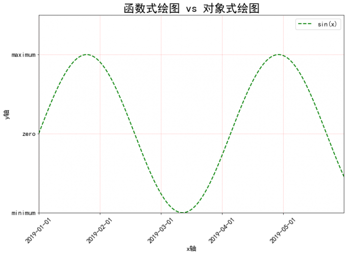
2.4 Thinking
- 请思考两种绘图模式的优缺点和各自适合的使用场景
- 在第五节绘图模板中我们是以OO模式作为例子展示的,请思考并写一个pyplot绘图模式的简单模板
这里借用之前的笔记,用一个稍微复杂点的例子来展示两种绘图模式的区别。
面向对象编程绘图
1
2
3
4
5
6
7
8
9
10
11
12
13
14
15
16
17
18
19
20
21
22
23
24
25
26
27
28
29
30
31
32
33
34
35
36
37
38
39
40
41
42
43
44import matplotlib.pyplot as plt
import numpy as np
plt.rcParams['font.sans-serif'] = ['SimHei']
plt.rcParams['axes.unicode_minus'] = False
# 对象式绘图
# pyplot 模块中的 figure() 函数创建名为 fig 的 Figure 对象
fig = plt.figure(figsize = (12, 8))
# 在 Figure 对象中创建一个 Axes 对象,每个 Axes 对象即为一个绘图区域
ax = fig.add_subplot(111)
# generate data
start_val, stop_val, num_val = 0, 10, 1000
x = np.linspace(start_val, stop_val, num_val)
y = np.sin(x)
# y = sin(x)
# '--g,': format_string, equals with a combination of linestyle, color, market, 即折线、绿色、像素点
ax.plot(x, y, '--g', lw = 2, label = 'sin(x)')
# 调整坐标范围
x_min, x_max = 0, 10
y_min, y_max = 0, 1.5
ax.set_xlim(x_min, x_max)
ax.set_ylim(y_min, y_max)
# 设置坐标轴标签
plt.xlabel('x轴', fontsize = 15)
plt.ylabel('y轴', fontsize = 15)
x_location = np.arange(0, 10, 2)
x_labels = ['2019-01-01', '2019-02-01', '2019-03-01', '2019-04-01', '2019-05-01']
y_location = np.arange(-1, 1.5, 1)
y_labels = [u'minimum', u'zero', u'maximum']
plt.xticks(x_location, x_labels, rotation = 45, fontsize = 15)
plt.yticks(y_location, y_labels, fontsize = 15)
# ls: linestyle
plt.grid(True, ls = ':', color = 'r', alpha = 0.5)
plt.title('函数式绘图 vs 对象式绘图', fontsize = 25)
plt.legend(loc = 'upper right', fontsize = 15)
plt.show()Result:
函数式绘图
1
2
3
4
5
6
7
8
9
10
11
12
13
14
15
16
17
18
19
20
21
22
23
24
25
26
27
28
29
30
31
32
33
34
35
36
37
38
39
40
41
42import matplotlib.pyplot as plt
import numpy as np
plt.rcParams['font.sans-serif'] = ['SimHei']
plt.rcParams['axes.unicode_minus'] = False
# step one: create figure and fix size
plt.figure(figsize = (12, 6)) # length x width
# step two: generate data
start_val = 0 # start value
stop_val = 10 # end value
num_val = 1000 # samples number
x = np.linspace(start_val, stop_val, num_val)
y = np.sin(x)
plt.plot(x, y, '--g,', lw = 2, label = '$sin(x)$')
# step three: adjust axis
x_min = 0
x_max = 10
y_min = 0
y_max = 1.5
plt.xlim(x_min, x_max)
plt.ylim(y_min, y_max)
# step four: set axis label
plt.xlabel('x轴', fontsize = 15)
plt.ylabel('y轴', fontsize = 15)
x_location = np.arange(0, 10, 2)
x_labels = ['2019-01-01', '2019-02-01', '2019-03-01', '2019-04-01', '2019-05-01']
y_location = np.arange(-1, 1.5, 1)
y_labels = [u'minimum', u'zero', u'maximum']
plt.xticks(x_location, x_labels, rotation = 45, fontsize = 15)
plt.yticks(y_location, y_labels, fontsize = 15)
# step five: set grid
# ls: linestyle
plt.grid(True, ls = ':', color = 'r', alpha = 0.5)
plt.title('函数式绘图', fontsize = 25)
plt.legend(loc = 'upper right', fontsize = 15)
plt.show()Result:
3. 艺术画笔见乾坤
3.1 Matplotlib 原理
3.1.1 绘图步骤
matplotlib 绘图的原理是借助 Artist
对象在画布 (Canvas) 上绘制
(Render)图形。这与人作画的步骤类似: 1. 准备画布; 2.
准备好颜料、画笔等制图工具; 3. 作画
对应地,Matplotlib 也有三层 API:
- 绘图区:
matplotlib.backend_bases.FigureCanvas代表了绘图区,所有的图像都是在绘图区完成的; - 渲染器:
matplotlib.backend_bases.Renderer表示渲染器,可以近似理解为画笔,控制如何在FigureCanvas上画图; - 图表组件:
matplotlib.artist.Artist代表了具体的图表组件,即调用了Renderer的接口在Canvas上作图。 - 前两者处理程序和计算机的底层交互的事项,第三项
Artist就是具体的调用接口来做出我们想要的图,比如图形、文本、线条的设定。所以通常来说,我们95%的时间,都是用来和matplotlib.artist.Artist类打交道的。
3.1.2 Artist 分类
Artist 有两种类型:
primitives基本要素,它包含一些我们要在绘图区作图用到的标准图形对象,如曲线
Line2D,文字Text,矩形Rectangle,图像Image等。containers容器,用来装基本要素的地方,包括图形
Figure、坐标系Axes和坐标轴Axis。他们之间的关系如下所示:
可视化中,常见的 Artist 类可以参考下表。
| Axes helper method | Artist | Container |
|---|---|---|
bar - bar charts |
Rectangle |
ax.patches |
errorbar - error bar plots |
Line2D and Rectangle |
ax.lines and ax.patches |
fill - shared area |
Polygon |
ax.patches |
hist - histograms |
Rectangle |
ax.patches |
imshow - image data |
AxesImage |
ax.images |
plot - xy plots |
Line2D |
ax.lines |
scatter - scatter charts |
PolyCollection |
ax.collections |
三列各自的含义分别表示:
Axes helper method表示
Matplotlib中子图上的辅助方法,可以理解为可视化中不同种类的图表类型,如柱状图,折线图,直方图等,这些图表都可以用这些辅助方法绘制。Artist表示图表背后的
Artist类,比如折线图方法plot在底层用到的就是Line2D这一Artist类。Container表示
Artist的列表容器,例如所有在子图中创建的Line2D对象都会被自动收集到ax.lines返回的列表中。
后面的案列内容会更清楚地阐述这三者之间的关系。通常情况下,我们只需记住第一列的辅助方法及逆行绘图即可,而无需关注其底层具体用了什么类。但是了解底层类有助于我们绘制一些复杂的图表。
3.2 Primitives 基本元素
各个容器中可能会包含多种 primitives
基本元素,所以此处先介绍 primitives,再介绍容器
container。 primitives 主要包含如下种类:
- 曲线
Line2D; - 矩形
Rectangle; - 多边形
Polygon; - 图像
image
3.2.1 2Dlines
Matplotlib 中曲线的绘制主要通过类
matplotlib.lines.line2D 来完成。其中线 line
的含义:它表示的可以是连接所有顶点的实现央视,也可以是每个顶点的标记。此外,这条线也会受到会话风格的影响,比如,我们可以创建虚线种类的线。
它的构造函数:
1 | class matplotlib.lines.Line2D(xdata, ydata, linewidth=None, linestyle=None, color=None, marker=None, markersize=None, markeredgewidth=None, markeredgecolor=None, markerfacecolor=None, markerfacecoloralt='none', fillstyle=None, antialiased=None, dash_capstyle=None, solid_capstyle=None, dash_joinstyle=None, solid_joinstyle=None, pickradius=5, drawstyle=None, markevery=None, **kwargs) |
其中常用的参数有:
xdata:需要绘制的line中点在x轴上的取值,若忽略,则默认为range(1, len(ydata)+1);ydata:需要绘制的line中点的在y轴上的取值;linewidth:线条的宽度;linewidth:线条的宽度;linestyle:线性;color:线条的颜色;marker:点的标记,详细可参考 markers APImarkersize:标记的size
更多参数说明可查看 Line2D 官方文档
Load modules
1 | import numpy as np |
如何设置
Line2D的属性可以通过如下方式设置线的属性:
直接在
plot()函数中设置;借助
plot函数的参数,可以便捷地设置属性。1
2
3x = range(0, 5)
y = [2, 5, 7, 8, 10]
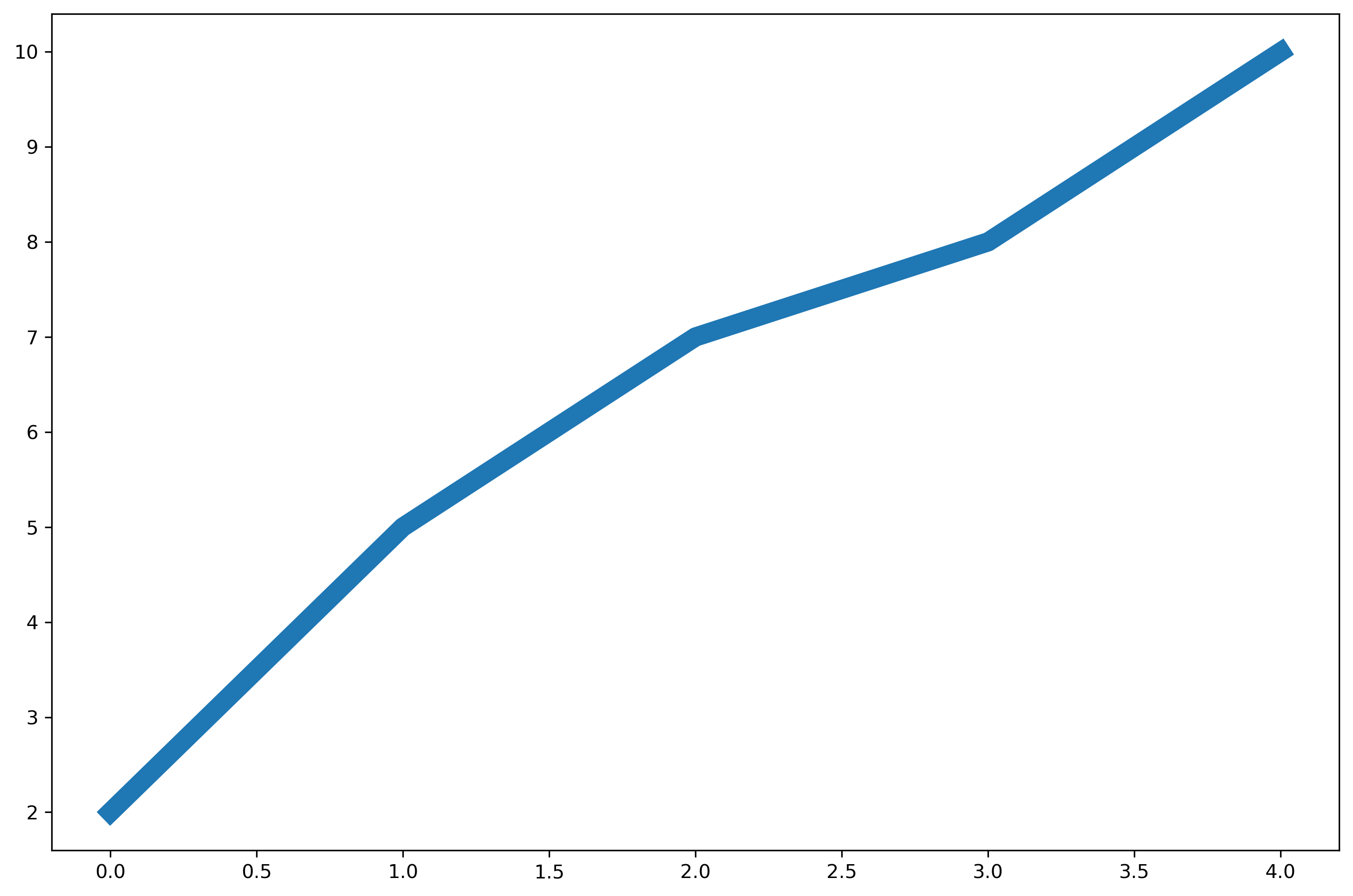
plt.plot(x, y, linewidth = 10) # 设置线的粗细参数为 10Results:
通过获得线对象,对线对象进行设置;
借助面向对象编程,先获取线对象,然后对其属性进行设置。
1
2
3
4x = range(0,5)
y = [2,5,7,8,10]
line, = plt.plot(x, y, '-') # 这里等号坐标的line,是一个列表解包的操作,目的是获取plt.plot返回列表中的Line2D对象
line.set_antialiased(False); # 关闭抗锯齿功能Results:
Note:注意到这里使用了
line来存储plt.plot()的返回对象,这里等号左边的line是一个解包的操作,目的是获取plt.plot返回列表中的Line2D对象,特别地,plt.plot的返回为:1
[<matplotlib.lines.Line2D at 0x248e34d2760>]
获得线对象,使用
setp()函数设置也可以先获得线属性,然后使用
setp函数(set property)设置。1
2
3
4x = range(0,5)
y = [2,5,7,8,10]
lines = plt.plot(x, y)
plt.setp(lines, color='r', linewidth=10)Results:

如何绘制
lines1)绘制直线
line;首先介绍两种绘制直线
line常用的方法:plot方法绘制1
2
3
4
5
6
7
8
9
10# 1. plot方法绘制
x = range(0,5)
y1 = [2,5,7,8,10]
y2= [3,6,8,9,11]
fig,ax= plt.subplots()
ax.plot(x,y1)
ax.plot(x,y2) # 通过直接使用辅助方法画线
plt.show()
print(ax.lines);Results:

1
[<matplotlib.lines.Line2D object at 0x00000248E374F0A0>, <matplotlib.lines.Line2D object at 0x00000248E374FF40>]
通过直接使用辅助方法画线,打印
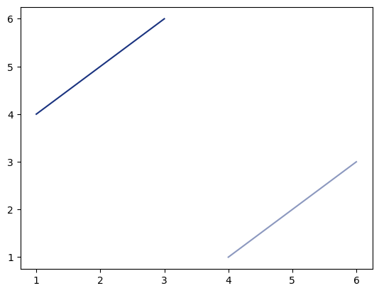
ax.lines后可以看到在matplotlib在底层创建了两个Line2D对象Line2D对象绘制1
2
3
4
5
6
7
8
9x = range(0,5)
y1 = [2,5,7,8,10]
y2= [3,6,8,9,11]
fig,ax= plt.subplots()
lines = [Line2D(x, y1), Line2D(x, y2,color='orange')] # 显式创建Line2D对象
for line in lines:
ax.add_line(line) # 使用add_line方法将创建的Line2D添加到子图中
ax.set_xlim(0,4)
ax.set_ylim(2, 11);
2)
errorbar绘制误差折线图;pyplot里有个专门绘制误差线的功能,通过errorbar类实现,它的构造函数:1
matplotlib.pyplot.errorbar(x, y, yerr=None, xerr=None, fmt='', ecolor=None, elinewidth=None, capsize=None, barsabove=False, lolims=False, uplims=False, xlolims=False, xuplims=False, errorevery=1, capthick=None, *, data=None, **kwargs)
其中最主要的参数包括:
- x:需要绘制的
line中点的在x轴上的取值
- y:需要绘制的
line中点的在y轴上的取值
- yerr:指定
y轴水平的误差
- xerr:指定
x轴水平的误差
- fmt:指定折线图中某个点的颜色,形状,线条风格,例如
co--
- ecolor:指定
error bar的颜色
- elinewidth:指定
error bar的线条宽度
绘制
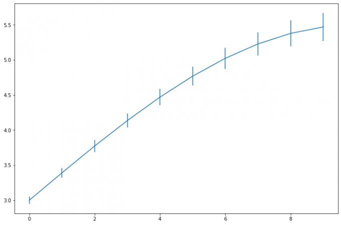
errorbar:1
2
3
4
5fig = plt.figure()
x = np.arange(10)
y = 2.5 * np.sin(x / 20* np.pi)
yerr = np.linspace(0.05, 0.2, 10)
plt.errorbar(x, y + 3, yerr = yerr, label = 'both limits (default)')Result:
3.2.2 patches
matplotlib.patches.Patch
类是二维图形类,并且它是众多二维图形的负类,它的所有子类见 matplotlib.patches
API,Patch 类的构造函数:
1 | Patch(edgecolor=None, facecolor=None, color=None, linewidth=None, linestyle=None, antialiased=None, hatch=None, fill=True, capstyle=None, joinstyle=None, **kwargs) |
本小节主要聚焦三种最常见的子类,矩形、多边形和楔形。
Rectangle-矩形Rectangle矩形类在官网中的定义是:通过描点xy及宽度和高度生成。Rectangle本身主要比较简单,即xy控制描点,width和height分别控制宽和高。它的构造函数:1
class matplotlib.patches.Rectangle(xy, width, height, angle=0.0, **kwargs)
在实际使用过程中最常用的是
hist直方图 和bar条形图。hist直方图1
matplotlib.pyplot.hist(x,bins=None,range=None, density=None, bottom=None, histtype='bar', align='mid', log=False, color=None, label=None, stacked=False, normed=None)
常用参数及含义:
- x: 数据集,最终的直方图将对数据集进行统计
- bins: 统计的区间分布
- range:
tuple, 显示的区间,range在没有给出bins时生效 - density:
bool,默认为false,显示的是频数统计结果,为True则显示频率统计结果,这里需要注意,频率统计结果=区间数目/(总数*区间宽度),和normed效果一致,官方推荐使用density - histtype: 可选{
bar,barstacked,step,stepfilled}之一,默认为bar,推荐使用默认配置,step使用的是梯状,stepfilled则会对梯状内部进行填充,效果与bar类似 - align: 可选{
left,mid,right}之一,默认为mid,控制柱状图的水平分布,left或者right,会有部分空白区域,推荐使用默认 - log:
bool,默认False,即y坐标轴是否选择指数刻度 - stacked:
bool,默认为False,是否为堆积状图
借助
hist绘制直方图:1
2
3
4
5
6
7x=np.random.randint(0,100,100) # 生成[0-100)之间的100个数据,即 数据集
bins=np.arange(0,101,10) # 设置连续的边界值,即直方图的分布区间 [0,10), [10,20).
plt.hist(x,bins,color='fuchsia',alpha=0.5) # alpha设置透明度,0为完全透明
plt.xlabel('scores')
plt.ylabel('count')
plt.xlim(0,100); # 设置x轴分布范围
plt.show()Results:

Rectangle矩阵类绘制直方图:1
2
3
4
5
6
7
8
9
10
11
12
13
14
15
16
17
18
19
20
21
22df = pd.DataFrame(columns = ['data'])
df.loc[:,'data'] = x
df['fenzu'] = pd.cut(df['data'], bins=bins, right = False,include_lowest=True)
df_cnt = df['fenzu'].value_counts().reset_index()
df_cnt.loc[:,'mini'] = df_cnt['index'].astype(str).map(lambda x:re.findall('\[(.*)\,',x)[0]).astype(int)
df_cnt.loc[:,'maxi'] = df_cnt['index'].astype(str).map(lambda x:re.findall('\,(.*)\)',x)[0]).astype(int)
df_cnt.loc[:,'width'] = df_cnt['maxi']- df_cnt['mini']
df_cnt.sort_values('mini',ascending = True,inplace = True)
df_cnt.reset_index(inplace = True,drop = True)
#用Rectangle把hist绘制出来
fig = plt.figure()
ax1 = fig.add_subplot(111)
for i in df_cnt.index:
rect = plt.Rectangle((df_cnt.loc[i,'mini'],0),df_cnt.loc[i,'width'],df_cnt.loc[i,'fenzu'])
ax1.add_patch(rect)
ax1.set_xlim(0, 100)
ax1.set_ylim(0, 16)Results:

bar柱状图1
matplotlib.pyplot.bar(left, height, alpha=1, width=0.8, color=, edgecolor=, label=, lw=3)
常用的参数:
- left:x轴的位置序列,一般采用range函数产生一个序列,但是有时候可以是字符串
- height:y轴的数值序列,也就是柱形图的高度,一般就是我们需要展示的数据;
- alpha:透明度,值越小越透明
- width:为柱形图的宽度,一般这是为0.8即可;
- color或facecolor:柱形图填充的颜色;
- edgecolor:图形边缘颜色
- label:解释每个图像代表的含义,这个参数是为legend()函数做铺垫的,表示该次bar的标签
与上述类似,同样有两种方式绘制柱状图:
bar绘制柱状图
Rectangle矩形类绘制柱状图
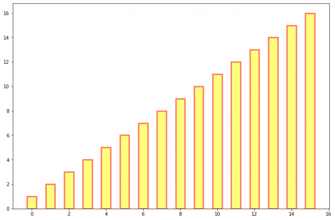
bar绘制柱状图1
2y = range(1,17)
plt.bar(np.arange(16), y, alpha=0.5, width=0.5, color='yellow', edgecolor='red', label='The First Bar', lw=3);Results:
Rectangle1
2
3
4
5
6
7
8fig = plt.figure()
ax1 = fig.add_subplot(111)
for i in range(1, 17):
rect = plt.Rectangle((i+0.25, 0), 0.5, i)
ax1.add_patch(rect)
ax1.set_xlim(0, 16)
ax1.set_ylim(0, 16);Results:

- left:x轴的位置序列,一般采用range函数产生一个序列,但是有时候可以是字符串
Polygon-多边形matplotlib.patches.Polygon类是多边形类,它的构造函数:1
class matplotlib.patches.Polygon(xy, closed=True, **kwargs)
参数说明:
xy是一个 N \times 2 的numpy.array,为多边形的顶点。closed为True则制定多边形将起点和终点重合从而显式关闭多边形。
matplotlib.patches.Polygon类中常用的是fill类,它是基于xy绘制一个填充的多边形,它的定义:1
matplotlib.pyplot.fill(args, data=None, *kwargs)
参数说明:关于
x、y和color的序列,其中color是可选的参数,每个多边形都是由其他节点的x和y位置列表定义,后面可以选择一个颜色说明符。用
fill来绘制图形1
2
3
4x = np.linspace(0, 5*np.pi, 1000)
y1 = np.sin(x)
y2 = np.sin(2*x)
plt.fill(x, y1, color = 'g', alpha = 0.3);Results:

Wedge-楔形matplotlib.patches.Wedge类是楔形类,构造函数为:1
class matplotlib.patches.Wedge(center, r, theta1, theta2, width=None, **kwargs)
一个
Wedge-楔形是以坐标x, y为中心,半径为r,从 \theta_1 扫到 \theta_2(单位是度)。如果宽度给定,则从内半径r-宽度 到外半径r画出部分楔形。wedge中比较常见的是绘制饼状图。以绘制饼图为例。通常我们可以使用
matplotlib.pyplot.pie直接绘制饼图,其构造函数有如下:1
matplotlib.pyplot.pie(x, explode=None, labels=None, colors=None, autopct=None, pctdistance=0.6, shadow=False, labeldistance=1.1, startangle=0, radius=1, counterclock=True, wedgeprops=None, textprops=None, center=0, 0, frame=False, rotatelabels=False, *, normalize=None, data=None)
制作数据
x的饼图,每个楔子的面积用x/sum(x)表示。其主要的参数是前四个:- x:契型的形状,一维数组。
- explode:如果不是等于
None,则是一个len(x)数组,它指定用于偏移每个楔形块的半径的分数; - labels:用于指定每个契型块的标记,取值是列表或为
None; - colors:饼图循环使用的颜色序列。如果取值为
None,将使用当前活动循环中的颜色; - startangle:饼状图开始的绘制的角度。
pie函数绘制饼图:1
2
3
4
5
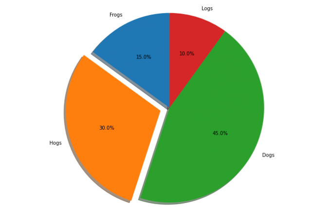
6labels = 'Frogs', 'Hogs', 'Dogs', 'Logs'
sizes = [15, 30, 45, 10]
explode = (0, 0.1, 0, 0)
fig1, ax1 = plt.subplots()
ax1.pie(sizes, explode=explode, labels=labels, autopct='%1.1f%%', shadow=True, startangle=90)
ax1.axis('equal'); # Equal aspect ratio ensures that pie is drawn as a circle.Results:
wedge绘制饼图1
2
3
4
5
6
7
8
9
10
11
12
13
14
15fig = plt.figure(figsize=(5,5))
ax1 = fig.add_subplot(111)
theta1 = 0
sizes = [15, 30, 45, 10]
patches = []
patches += [
Wedge((0.5, 0.5), .4, 0, 54),
Wedge((0.5, 0.5), .4, 54, 162),
Wedge((0.5, 0.5), .4, 162, 324),
Wedge((0.5, 0.5), .4, 324, 360),
]
colors = 100 * np.random.rand(len(patches))
p = PatchCollection(patches, alpha=0.8)
p.set_array(colors)
ax1.add_collection(p);Results:

3.2.3 collection
collections
类是用来绘制一组对象的集合,collections
有许多不同的子类,如
RegularPolyCollection,CircleCollection,
Pathcollection,分别对应不同的集合子类型。其中比较常用的是散点图,它是属于
PathCollection 子类,scatter
方法提供了该类的封装,根据 x 与 y
绘制不同大小或颜色标记的散点图。它的构造方法:
1 | Axes.scatter(self, x, y, s=None, c=None, marker=None, cmap=None, norm=None, vmin=None, vmax=None, alpha=None, linewidths=None, verts=, edgecolors=None, , plotnonfinite=False, data=None, *kwargs) |
主要参数为:
- x:数据点x轴的位置
- y:数据点y轴的位置
- s:尺寸大小
- c:可以是单个颜色格式的字符串,也可以是一系列颜色
- marker: 标记的类型
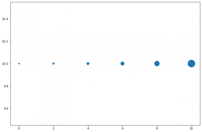
用 scatter 绘制散点图
1 | x = [0,2,4,6,8,10] |
Results:
3.2.4 images
images 是 matplotlib 中绘制
image 图像的类,其构造函数:
1 | class matplotlib.image.AxesImage(ax, cmap=None, norm=None, interpolation=None, origin=None, extent=None, filternorm=True, filterrad=4.0, resample=False, **kwargs) |
最常用的 imshow
可以根据数组绘制成图像,它的构造函数:
1 | matplotlib.pyplot.imshow(X, cmap=None, norm=None, aspect=None, interpolation=None, alpha=None, vmin=None, vmax=None, origin=None, extent=None, shape=, filternorm=1, filterrad=4.0, imlim=, resample=None, url=None, , data=None, *kwargs) |
使用 imshow
画图时首先需要传入一个数组,数组对应的是空间内的像素位置和像素点的值,interpolation
参数可以设置不同的插值方法,具体效果如下:
1 | methods = [None, 'none', 'nearest', 'bilinear', 'bicubic', 'spline16', |
Results:
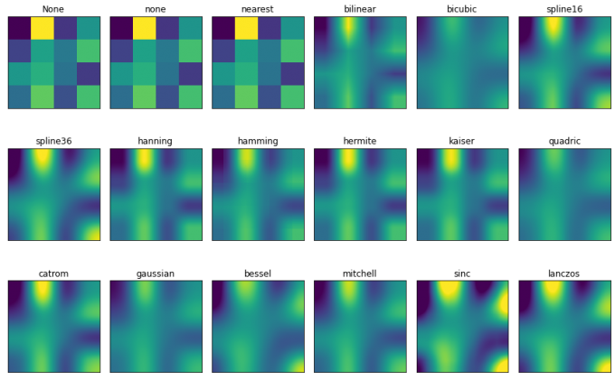
Note:其中,nrows 和 ncols
分别表示子图的行和列,此处表示 3 行 6
列。返回值 axs 为 18 个子图,因此可以通过
for 循环对其进行遍历,并对各个子图的属性进行修改。
3.3 Object container 对象容器
容器会包含一些
primitives,并且容器还有它自身的属性。
比如 Axes Artist,它是一种容器,它包含了很多
primitives,比如
Line2D,Text;同时,它也有自身的属性,比如
xscal,用来控制X轴是 linear 还是
log 的。
3.3.1 Figure 容器
matplotlib.figure.Figure 是 Artist 最顶层的
container
-对象容器,它包含了图表中的所有元素。一张图表的背景就是在
Figure.patch 的一个矩形 Rectangle。
当我们向图表添加 Figure.add_subplot() 或者
Figure.add_axes() 元素时,这些都会被添加到
Figure.axes 列表中。
1 | fig = plt.figure() |
Results:

Note:
我们发现,这里面得到的两个子图没有对齐,这是为什么呢?因为
add_axes是以figure容器为基准进行对齐的。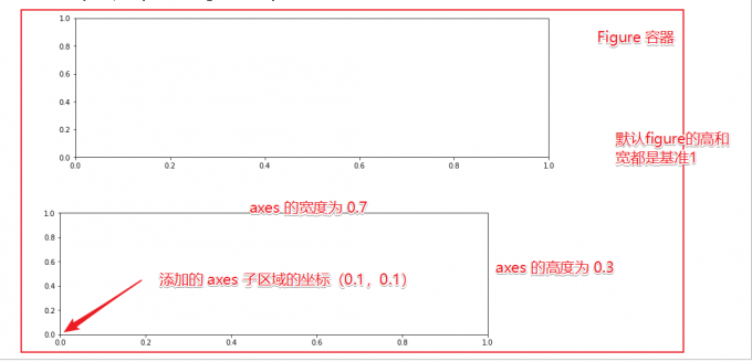
接下来,为了突出两种方式的区别,我们对图形重新绘制:
1
2
3
4
5
6
7fig = plt.figure()
ax1 = fig.add_subplot(211) # 作一幅2*1的图,选择第1个子图
ax1 = fig.add_subplot(212)
ax2 = fig.add_axes([0.0, 0., 0.7, 0.3]) # 位置参数,四个数分别代表了(left,bottom,width,height)
print(ax1)
print(fig.axes) # fig.axes 中包含了subplot和axes两个实例, 刚刚添加的
plt.show()Results:

可以发现,两个的基准对齐位置不同,可以理解为,
add_subplot是重新创建了一个subplot容器,因此,在基于此函数进行增添子图的时候,是在容器内部进行对齐。而add_axes则默认是基于figure进行操作和对齐。如果要在这种情况下进行对齐,可以首先获得subplot的位置信息。1
2
3
4
5
6
7
8
9
10
11
12
13fig = plt.figure()
ax1 = fig.add_subplot(211) # 作一幅2*1的图,选择第1个子图
position = ax1.get_position()
#(x0, y0) and (x1, y1) represent the the point coordinates of the lower left and upper right corner respectively
width = position.x1 - position.x0
height = position.y1 - position.y0
ax2 = fig.add_axes([position.x0, position.y0 - 0.4, width, height]) # 位置参数,四个数分别代表了(left,bottom,width,height)
print(ax1)
print(fig.axes) # fig.axes 中包含了subplot和axes两个实例, 刚刚添加的
plt.show()Results:

Note:
ax1.get_position返回一个Bbox对象,可以通过其x0,y0,x1和y1得到左下角和右上角的坐标信息。即:
综上,通过获得位置参数之后,将两张子图进行了对齐。
由于 Figure 维持了
current axes,因此你不应该手动的从 Figure.axes
列表中添加删除元素,而是要通过
Figure.add_subplot()、Figure.add_axes()
来添加元素,通过Figure.delaxes()来删除元素。但是你可以迭代或者访问
Figure.axes 中的 Axes,然后修改这个
Axes 的属性。
比如下面的遍历 axes 里的内容,并且添加网格线:
1 | fig = plt.figure() |
Results:

Figure 也有它自己的
text、line、patch、image。你可以直接通过
add primitive 语句直接添加。但是注意 Figure
默认的坐标系是以像素为单位,需要转换成 figure
坐标系:(0,0) 表示左下点,(1,1)
表示右上点。
Figure容器的常见属性:
Figure.patch属性:Figure的背景矩形
Figure.axes属性:一个Axes实例的列表(包括Subplot)
Figure.images属性:一个FigureImages patch列表
Figure.lines属性:一个Line2D实例的列表(很少使用)
Figure.legends属性:一个Figure Legend实例列表(不同于Axes.legends)
Figure.texts属性:一个Figure Text实例列表
3.3.2 Axes 坐标系容器
matplotlib.axes.Axes 是 matplotlib
的核心。大量的用于绘图的 Artist
存放在它内部,并且它有许多辅助方法来创建和添加 Artist
给它自己,而且它也有许多赋值方法来访问和修改这些
Artist。
和 Figure 容器类似,Axes 包含了一个
patch 属性,对于笛卡尔坐标系而言,它是一个
Rectangle;对于极坐标而言,它是一个
Circle。这个 patch
属性决定了绘图区域的形状、背景和边框。
1 | fig = plt.figure() |
Results:

Axes有许多方法用于绘图,如.plot()、.text()、.hist()、.imshow()等方法用于创建大多数常见的primitive(如Line2D,Rectangle,Text,Image等等)。在primitives中已经涉及,不再赘述。
Subplot 就是一个特殊的
Axes,其实例是位于网格中某个区域的 Subplot
实例。其实你也可以在任意区域创建
Axes,通过下述代码来创建一个任意区域的
Axes:
1 | Figure.add_axes([left,bottom,width,height]) |
其中,left, bottom, width,
height 都是 [0—1]
之间的浮点数,他们代表了相对于 Figure 的坐标。
你不应该直接通过 Axes.lines 和 Axes.patches
列表来添加图表。因为当创建或添加一个对象到图表中时,Axes会做许多自动化的工作:
- 它会设置
Artist中figure和axes的属性,同时默认Axes的转换;
- 它也会检视
Artist中的数据,来更新数据结构,这样数据范围和呈现方式可以根据作图范围自动调整。
可以使用Axes的辅助方法 .add_line() 和
.add_patch() 方法来直接添加。
此外,Axes 还包含两个最重要的
Artist container:
ax.xaxis:XAxis对象的实例,用于处理x轴tick以及label的绘制;ax.yaxis:YAxis对象的实例,用于处理y轴tick以及label的绘制;
Axes容器的常见属性有:
artists:Artist实例列表
patch:Axes所在的矩形实例
collections:Collection实例
images:Axes图像
legends:Legend实例
lines:Line2D实例
patches:Patch实例
texts:Text实例
xaxis:matplotlib.axis.XAxis实例
yaxis:matplotlib.axis.YAxis实例
3.3.3 Axis 坐标轴容器
matplotlib.axis.Axis 实例处理
tick line、grid line、tick label
以及 axis label 的绘制,它包括坐标轴上的刻度线、刻度
label、坐标网格、坐标轴标题。通常可以独立的配置
y 轴的左边刻度以及右边的刻度,也可以独立地配置
x 轴的上边刻度以及下边的刻度。
刻度包括主刻度和次刻度,它们都是 Tick 刻度对象。
Axis 也存储了用于自适应、平移以及缩放的
data_interval 和 view_interval。它还有
Locator 实例和 Formatter
实例用于控制刻度线的位置以及刻度 label。
每个 Axis 都有一个 label
属性,也有主刻度列表和次刻度列表。这些 ticks 是
axis.XTick和 axis.YTick 实例,它们包含着
line primitive 以及 text primitive
用来渲染刻度线以及刻度文本。
刻度是动态创建的,只有在需要创建的时候才创建(比如缩放的时候)。Axis
也提供了一些辅助方法来获取刻度文本、刻度线位置等等:
常见的如下:
1 | # 不用print,直接显示结果 |
获取刻度线位置
1
axis.get_ticklocs() # 获取刻度线位置
Results:
1
array([-0.5, 0. , 0.5, 1. , 1.5, 2. , 2.5, 3. , 3.5, 4. , 4.5])
获取刻度线
label列表返回一个
Text实例的列表,可以通过minor=True|False关键字参数控制输出minor还是major的tick label。1
axis.get_ticklabels()
Results:
1
2
3
4
5
6
7
8
9
10
11[Text(-0.5, 0, '-0.5'),
Text(0.0, 0, '0.0'),
Text(0.5, 0, '0.5'),
Text(1.0, 0, '1.0'),
Text(1.5, 0, '1.5'),
Text(2.0, 0, '2.0'),
Text(2.5, 0, '2.5'),
Text(3.0, 0, '3.0'),
Text(3.5, 0, '3.5'),
Text(4.0, 0, '4.0'),
Text(4.5, 0, '4.5')]获取刻度线列表
一个
Line2D实例的列表。可以通过minor=True|False关键字参数控制输出minor还是major的tick line。1
axis.get_ticklines() # 获取刻度线列表(
Results:
1
<a list of 22 Line2D ticklines objects>
获取轴刻度间隔
1
axis.get_data_interval()
Results:
1
array([0., 4.])
获取轴视角(位置)的间隔
1
axis.get_view_interval()
Results:
1
array([-0.2, 4.2])
下面的例子展示了如何调整一些轴和刻度的属性(忽略美观度,仅作调整参考):
1 | fig = plt.figure() # 创建一个新图表 |
Results:
3.3.4 Tick 容器
matplotlib.axis.Tick 是从 Figure 到
Axes 到 Axis 到 Tick
中最末端的容器对象。Tick 包含了
tick、grid line 实例以及对应的
label。
所有的这些都可以通过 Tick 的属性获取,常见的
tick 属性有 :
Tick.tick1line:Line2D实例
Tick.tick2line:Line2D实例
Tick.gridline:Line2D实例
Tick.label1:Text实例
Tick.label2:Text实例
其中,y 轴分为左右两个,因此 tick1
对应左侧的轴;tick2 对应右侧的轴。
x 轴分为上下两个,因此 tick1
对应下侧的轴;tick2 对应上侧的轴。
下面的例子展示了,如何将 Y
轴右边轴设为主轴,并将标签设置为美元符号且为绿色:
1 | fig, ax = plt.subplots() |
Results:
3.4 Thinking
primitives和container的区别和联系是什么,分别用于控制可视化图表中的哪些要素container是容器,可以理解为一个盒子,用来盛放Axis坐标轴、Axes坐标系 和Figure图形;primitives表示基本要素,包括Line2D,Rectangle,Text,AxesImage这些基本的绘图要素。
它们之间的关系是使用
Figure容器创建一个或多个Axes坐标轴容器或者Subplot实例,然后用Axes坐标轴实例的帮助方法创建primitives要素。接下来,我们用一个例子来演示。Create a
FigureinstanceWe create a
Figureinstance usingmatplotlib.pyplot.figure(), which is a convenience method for instantiatingFigureinstances and connecting them with user interface or drawing toolkitFigureCanvas.1
2
3
4
5
6
7import matplotlib.pyplot as plt
fig = plt.figure()
ax = fig.add_subplot(2,1,1) # two rows, one column, first plot
# or
fig2 = plt.figure()
ax2 = fig2.add_axes([0.15, 0.1, 0.7, 0.3])Results:

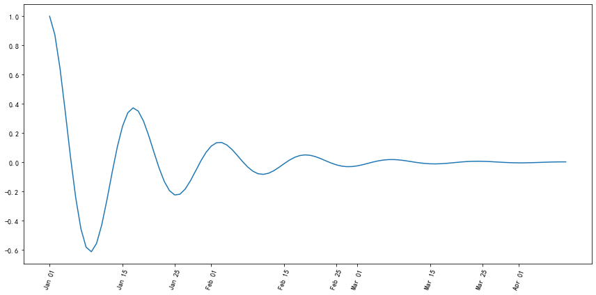
使用提供的drug数据集,对第一列yyyy和第二列state分组求和,画出下面折线图。PA加粗标黄,其他为灰色。图标题和横纵坐标轴标题,以及线的文本暂不做要求。
数据下载: Download Now
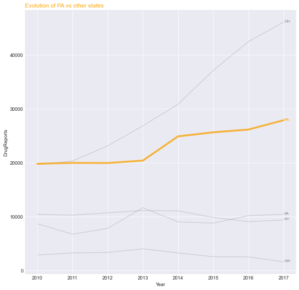
实现代码如下:
1
2
3
4
5
6
7
8
9
10
11
12
13
14
15
16import pandas as pd
data = pd.read_csv('./data/Drugs.txt', encoding = 'utf8', sep = '\t')
plot_var = data['State'].unique()
plot_data = data.groupby(['State', 'YYYY'])['DrugReports'].sum()
fig = plt.figure()
ax = fig.add_axes([0.1, 0.1, 0.8, 0.6])
ax.grid()
# rect = ax.patch
# rect.set_facecolor('grey', alpha = 0.5)
for var in plot_var:
if var != 'PA':
ax.plot(plot_data[var], 'grey');
else:
ax.plot(plot_data[var], 'orange', lw = 3);Results:

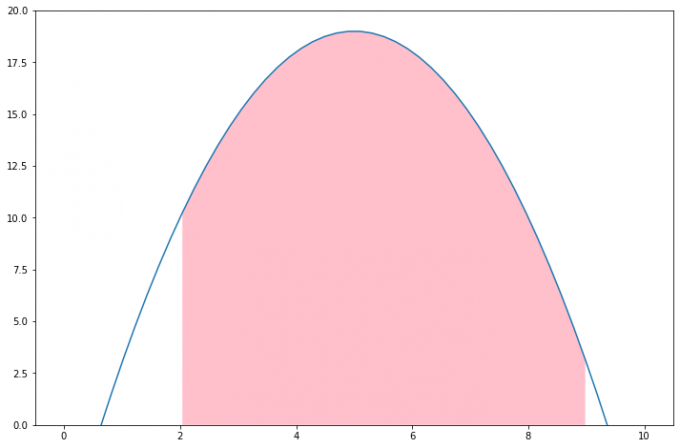
分别用一组长方形柱和填充面积的方式模仿画出下图,函数 y = -1 * (x - 2) * (x - 8) +10 在区间[2,9]的积分面积。如下图所示:

针对第一个长方形柱形
1
2
3
4
5
6
7
8
9
10
11
12
13
14
15
16
17
18
19
20
21
22
23
24
25
26
27
28
29
30import numpy as np
import matplotlib.pyplot as plt
x = np.linspace(0, 10, 50)
y = -1 * (x - 2) * (x - 8) +10
fig = plt.figure()
ax = fig.add_subplot(111)
plt.plot(x, y)
plt.ylim((0, 20))
def func(i, num_bars):
step = 7/num_bars
x = 2 + i * step
if i < num_bars/2:
y = -1 * (x - 2) * (x - 8) +10
else:
x1 = 2 + (i+1) * step
y = -1 * (x1 - 2) * (x1 - 8) +10
return x, y
num_bars = 56
for i in range(0,num_bars):
if i%2 == 0:
x1, y1 = func(i, num_bars)
rect = plt.Rectangle((x1,0),7/num_bars, y1)
ax.add_patch(rect)
else:
passResults:
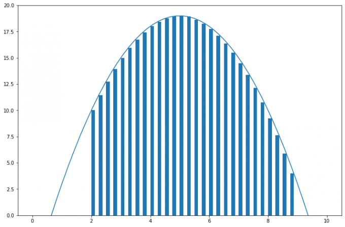
Note:为了使图形更为美观,此处对对称轴两端的矩形高度做了调整,左边的矩形高度等于矩形左边坐标轴所对应的函数值,而右边则取右边坐标轴对应的函数值。
栅栏面积填充
如果觉得矩形与曲线之间有一定间隔,不美观,则可以使用
fill_between函数进行填充,这样得到的填充区为坐标轴与曲线之间的无缝连接区域:1
2
3
4
5
6
7
8
9
10
11
12
13
14
15
16
17
18
19
20
21
22import numpy as np
import matplotlib.pyplot as plt
x = np.linspace(0, 10, 1000)
y = -1 * (x - 2) * (x - 8) +10
fig = plt.figure()
ax = fig.add_subplot(111)
plt.plot(x, y);
plt.ylim((0, 20));
num_bars = 56
for i in range(0,num_bars):
if i%2 == 0:
step = 7/num_bars
x1 = 2 + i * step
plt.fill_between(x, y, where=(x1 < x) & (x < x1+step), facecolor='pink')
else:
pass
plt.show()Results:

Note:需要注意的是:当设置的
num_bars条形的数量较大时,要控制np.linspace函数生成的x值要足够的多,才能生成正确的图形,因为x数量较少时,函数找不到参照的区域,会导致生成图形不对,如下图所示(将1000改为100):
面积填充
类似的,借助
fill_between函数,可以直接进行区域面积填充,如:1
2
3
4
5
6
7
8
9
10
11
12
13
14
15import numpy as np
import matplotlib.pyplot as plt
x = np.linspace(0, 10, 50)
y = -1 * (x - 2) * (x - 8) +10
fig = plt.figure()
ax = fig.add_subplot(111)
plt.plot(x, y);
plt.ylim((0, 20));
plt.fill_between(x, y, where=(2 < x) & (x < 9), facecolor='pink')
plt.show()Results:
3.5 Reference
4. 布局格式定方圆
Import modules
1
2
3
4
5
6
7import numpy as np
import pandas as pd
import matplotlib.pyplot as plt
plt.rcParams['font.sans-serif'] = ['SimHei'] #用来正常显示中文标签
plt.rcParams['axes.unicode_minus'] = False #用来正常显示负号
# plt.figure(dpi=300,figsize=(12,8))
plt.rcParams['figure.figsize']=(12,8)
4.1 Subplot
4.1.1 使用
plt.subplots 绘制均匀状态下的子图
返回元素分别是画布和子图构成的列表,第一个数字为行,第二个为列,默认值都为
1。构造函数:
1 | subplots(nrows=1, ncols=1, *, sharex=False, sharey=False, squeeze=True, subplot_kw=None, gridspec_kw=None, **fig_kw) |
参数说明:
nrows:行ncols:列sharexandsharey:分别表示是否共享横轴和纵轴刻度tight_layout:该函数可以调整子图的相对大小使字符不会重叠Case:
1
2
3
4
5
6
7
8
9
10
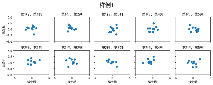
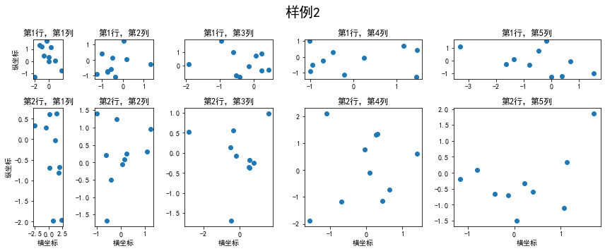
11fig, axs = plt.subplots(2, 5, figsize=(10, 4), sharex=True, sharey=True)
fig.suptitle('样例1', size=20)
for i in range(2):
for j in range(5):
axs[i][j].scatter(np.random.randn(10), np.random.randn(10))
axs[i][j].set_title('第%d行,第%d列'%(i+1,j+1))
axs[i][j].set_xlim(-5,5)
axs[i][j].set_ylim(-5,5)
if i==1: axs[i][j].set_xlabel('横坐标')
if j==0: axs[i][j].set_ylabel('纵坐标')
fig.tight_layout()Results:
subplots 是基于 OO
模式的写法,显式地创建一个或多个 axes
对象,然后在对应地子图对象中进行绘图操作。还有种方式是使用
subplot 这样基于 pyplot
模式的写法,每次在制定位置新建一个子图,并且之后的绘图操作都会只想当前子图,本质上
subplot 也是 Figure.add_subplot
的一种封装。
在调用 subplot
时一般需要传入三位数字,分别代表总行数,总列数,当前子图的
index:
1 | plt.figure() |
Results:
极坐标
projection除了常规的直角坐标系,也可以通过
projection方法创建极坐标系下的图表1
2
3
4
5
6
7
8N = 150
r = 2 * np.random.rand(N)
theta = 2 * np.pi * np.random.rand(N)
area = 200 * r**2
colors = theta
plt.subplot(projection='polar')
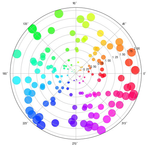
plt.scatter(theta, r, c=colors, s=area, cmap='hsv', alpha=0.75);Results:
思考:如何用
GridSpec绘制非均匀子图可以借助上一章所学习的楔形图来绘制玫瑰图,为了简单,此处我们随机生成
36个分支,每个分支的长度从0.1开始,逐步增加0.01,最终生成如下所示的玫瑰图:1
2
3
4
5
6
7
8
9
10
11
12
13
14
15
16
17
18from matplotlib.patches import Wedge
from matplotlib.collections import PatchCollection
fig = plt.figure(figsize=(9,9))
ax1 = fig.add_subplot(111)
theta1 = 0
num = 36
patches = []
patches = [
Wedge((0.5, 0.5), 0.01 + 0.01*i, i* 360/num, (1 + i) * 360/num) for i in range(num)
]
colors = 100 * np.random.rand(len(patches))
p = PatchCollection(patches, alpha=0.8)
p.set_array(colors)
ax1.add_collection(p);Result:

4.1.2 使用 GridSpec
绘制非均匀子图
所谓的非均匀包含两层含义,第一是指图的比例大小不同但没有跨行或者跨列,第二是指图为跨列或跨行状态。利用
add_gridspec 可以制定相对宽度比例 width_ratios
和相对高度比例参数 height_ratios。
1 | fig = plt.figure(figsize=(12, 5)) |
Results:
在上面的例子中出现了 spec[i, j]
的用法,事实上通过切片就可以实现子图的合并而达到跨图的功能。
1 | fig = plt.figure(figsize=(10, 4)) |
Results:
4.2 子图上的方法
补充一些子图的用法,常用直线的画法为:axhlive,
axvline 和 axline (horizontal, vertical and
any)
构造函数:
1
2
3axhline(y=0, xmin=0, xmax=1, **kwargs)
axvline(x=0, ymin=0, ymax=1, **kwargs)
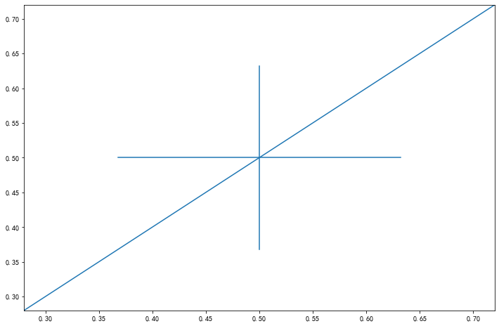
axline(xy1, xy2=None, *, slope=None, **kwargs)Cases:
1
2
3
4fig, ax = plt.subplots(figsize=(4,3))
ax.axhline(0.5,0.2,0.8)
ax.axvline(0.5,0.2,0.8)
ax.axline([0.3,0.3],[0.7,0.7]);Results:
使用
grid添加灰色网格1
2fig, ax = plt.subplots(figsize=(12,8))
ax.grid(True)Results:
使用
set_xscale设置坐标轴的规度(指对数坐标等)1
2
3
4
5
6
7
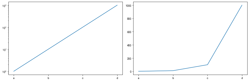
8fig, axs = plt.subplots(1, 2, figsize=(12, 4))
for j in range(2):
axs[j].plot(list('abcd'), [10**i for i in range(4)])
if j==0:
axs[j].set_yscale('log')
else:
pass
fig.tight_layout()Results:
4.3 Thinking
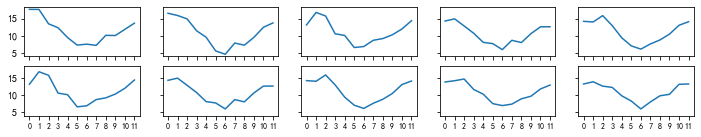
4.3.1 利用数据,画出每个月的月温度曲线
1 | ex1 = pd.read_csv('data/layout_ex1.csv') |
Results:
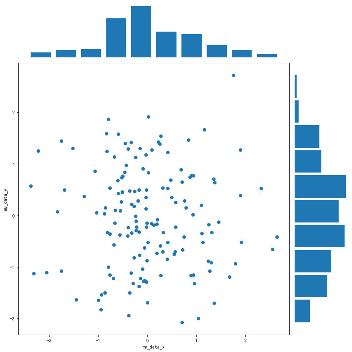
4.3.2. 用两种方式画出数据的散点图和边际分布
方式一:使用
gridspec方式1
2
3
4
5
6
7
8
9
10
11
12
13
14
15
16
17
18
19
20
21
22
23
24
25import numpy as np
import matplotlib.pyplot as plt
my_data_x, my_data_y = np.random.randn(2, 150)
# my_data_y = np.random.randn(2, 150)
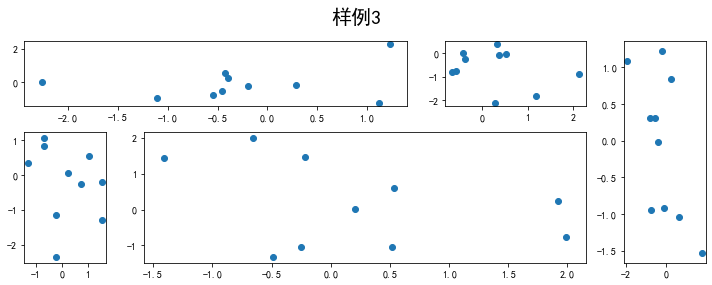
fig = plt.figure(figsize=(10,10))
spec = fig.add_gridspec(nrows = 2, ncols = 2, width_ratios = [5, 1], height_ratios = [1, 5])
ax1 = fig.add_subplot(spec[0, 0])
ax1.hist(my_data_x, density = True, rwidth = 0.8)
ax1.axis('off')
# Scatter
ax2 = fig.add_subplot(spec[1, 0])
ax2.scatter(my_data_x, my_data_y)
ax2.set_xlabel("my_data_x")
ax2.set_ylabel("my_data_y")
#
ax3 = fig.add_subplot(spec[1, 1])
ax3.hist(my_data_y, orientation = 'horizontal', density = True, rwidth = 0.9)
ax3.axis('off')
fig.tight_layout()Results:
此处也可以不设置
width_ratios和height_ratios,而是选择生成一个 6\times 6 的网格, 然后通过跨表格操作生成图形。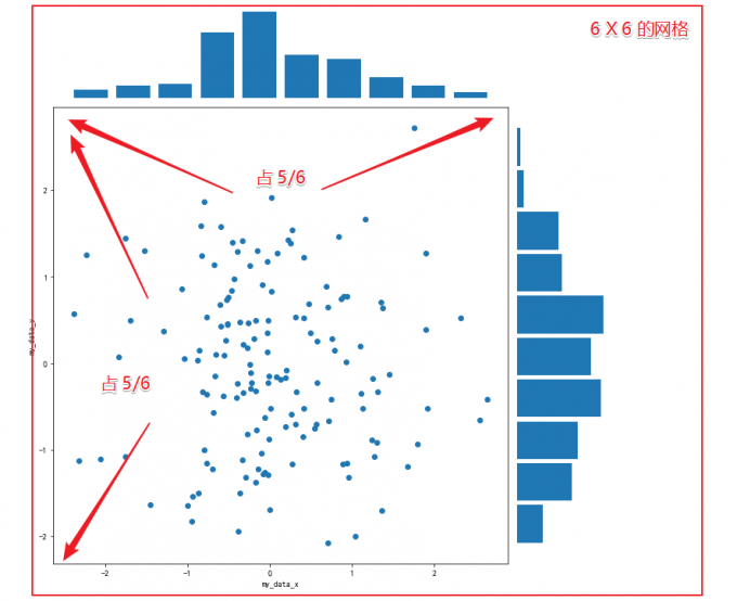
代码:
1
2
3
4
5
6
7
8
9
10
11
12
13
14
15
16
17
18fig = plt.figure(figsize=(8, 8))
spec = fig.add_gridspec(nrows=6, ncols=6) # (nrows,ncols) == figsize
#hist plot1
ax1 = fig.add_subplot(spec[0:1,0:5])
ax1.hist(my_data_x,density = True,rwidth = 0.9) # rwidth控制竹子宽度
ax1.axis("off")
#scatter plot
ax2 = fig.add_subplot(spec[1:6,0:5])
ax2.scatter(my_data_x, my_data_y)
ax2.set_xlabel("my_data_x")
ax2.set_ylabel("my_data_y")
ax2.grid()
#hist plot2
ax3 = fig.add_subplot(spec[1:6,5])
ax3.hist(my_data_y,orientation='horizontal',density = True,rwidth = 0.9) # rwidth控制竹子宽度
ax3.axis("off")
fig.tight_layout()Results:

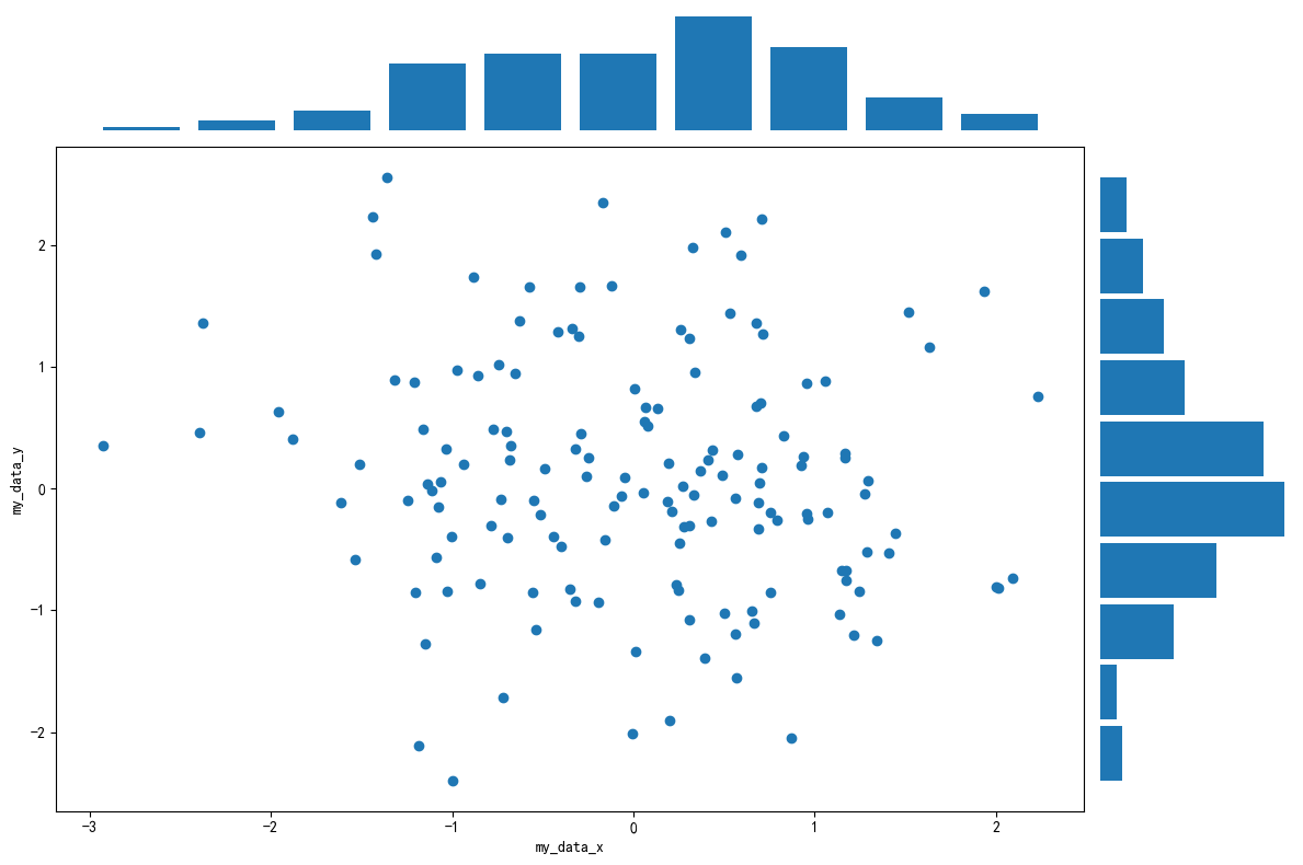
方式二:借助
gridspec生成网格自定义绘图1
2
3
4
5
6
7
8
9
10
11
12
13
14
15
16
17
18
19
20
21
22
23
24
25
26
27
28import numpy as np
import matplotlib.pyplot as plt
import matplotlib.gridspec as gridspec
my_data_x, my_data_y = np.random.randn(2, 150)
# my_data_y = np.random.randn(2, 150)
fig = plt.figure(figsize=(8,8))
spec = fig.add_gridspec(nrows = 2, ncols = 2, width_ratios = [5, 1], height_ratios = [1, 5])
fig = plt.figure(figsize = (12, 8), dpi = 100, facecolor = 'white')
gs = gridspec.GridSpec(6, 6)
graph_ax1 = fig.add_subplot(gs[0, :5])
graph_ax1.hist(my_data_x, density = True, rwidth = 0.8)
graph_ax1.axis('off')
# Scatter
graph_ax2 = fig.add_subplot(gs[1:6, :5])
graph_ax2.scatter(my_data_x, my_data_y)
graph_ax2.set_xlabel("my_data_x")
graph_ax2.set_ylabel("my_data_y")
graph_ax3 = fig.add_subplot(gs[1:6, 5])
graph_ax3.hist(my_data_y, orientation = 'horizontal', density = True, rwidth = 0.9)
graph_ax3.axis('off')
fig.tight_layout()Results:
5. 文字图例尽眉目
Import modules
1
2
3
4
5import matplotlib
import matplotlib.pyplot as plt
import numpy as np
import matplotlib.dates as mdates
import datetime
5.1 Figure 和
Axes 上的文本
Matplotlib
具有广泛的文本支持,包括对数学表达式的支持、对栅格和矢量输出的
TrueType 支持、具有任意旋转的换行分隔文本以及
Unicode 支持。
5.1.1 文本 API 示例
下面的命令是介绍了通过 pyplot API 和
objected-oriented API 分别创建文本的方式。
| pyplot API | OO API | description |
|---|---|---|
text |
text |
在子图axes的任意位置添加文本 |
annotate |
annotate |
在子图axes的任意位置添加注解,包含指向性的箭头 |
xlabel |
set_xlabel |
为子图axes添加x轴标签 |
ylabel |
set_ylabel |
为子图axes添加y轴标签 |
title |
set_title |
为子图axes添加标题 |
figtext |
text |
在画布figure的任意位置添加文本 |
suptitle |
suptitle |
为画布figure添加标题 |
通过一个综合例子,以 OO 模式展示这些 API
是如何控制一个图像中各部分的文本,在之后的内容再详细分析这些
api 的使用技巧。
1 | fig = plt.figure() |
5.1.2 text 子图上的文本
text 的调用方式为
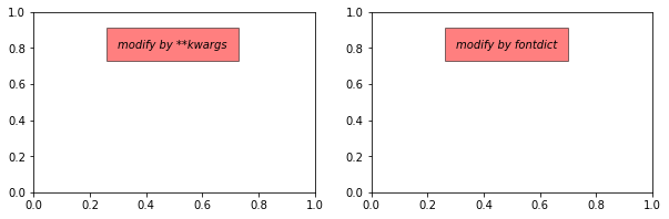
1 | Axes.text(x, y, s, fontdict=None, **kwargs) |
参数说明:
x,y: 为文本出现的位置,默认状态下即为当前坐标系下的坐标值;s:文本的内容;fontdict:可选参数,用于覆盖默认的文本属性**kwargs:关键字参数,也可以用于传入文本样式参数
接下来,重点解释下 fontdict 和 **kwargs
参数,这两种方式都可以用于调整呈现的文本样式,最终效果是一样的,不仅
text 方法,其他文本方法如 set_xlabel,
set_title
等同样适用这两种方式修改样式。通过一个例子演示这两种方法如何使用:
1 | fig = plt.figure(figsize=(10,3)) |
Results:
matplotlib中所有支持的样式参数请参考官网文档说明,大多数时候需要用到的时候再查询即可。
下表列举了一些常用的参数供参考。
| Property | Description |
|---|---|
alpha |
float or None 透明度,越接近0越透明,越接近1越不透明 |
backgroundcolor |
color 文本的背景颜色 |
bbox |
dict with properties for patches.FancyBboxPatch 用来设置text周围的box外框 |
color or c |
color 字体的颜色 |
fontfamily or family |
{FONTNAME, 'serif', 'sans-serif', 'cursive', 'fantasy', 'monospace'} 字体的类型 |
fontsize or size |
float or {'xx-small', 'x-small', 'small', 'medium', 'large', 'x-large', 'xx-large'} 字体大小 |
fontstyle or style |
{'normal', 'italic', 'oblique'} 字体的样式是否倾斜等 |
fontweight or weight |
{a numeric value in range 0-1000, 'ultralight', 'light', 'normal', 'regular', 'book', 'medium', 'roman', 'semibold', 'demibold', 'demi', 'bold', 'heavy', 'extra bold', 'black'} 文本粗细 |
horizontalalignment or ha |
{'center', 'right', 'left'} 选择文本左对齐右对齐还是居中对齐 |
linespacing |
float (multiple of font size) 文本间距 |
rotation |
float or {'vertical', 'horizontal'} 指text逆时针旋转的角度,“horizontal”等于0,“vertical”等于90 |
verticalalignment or va |
{'center', 'top', 'bottom', 'baseline', 'center_baseline'} 文本在垂直角度的对齐方式 |
5.1.3 xlabel and
ylabel
xlabel and ylabel 分别表示子图的
x,y 轴标签,其构造函数为:
1 | Axes.set_xlabel(xlabel, fontdict=None, labelpad=None, *, loc=None, **kwargs) |
参数说明:
xlabel:标签内容;fontdictand**kwargs:用来修改样式,上一小节已介绍;labelpad:标签和坐标轴的距离,默认为4;loc:标签位置,可选的值为left,center,right之一,默认为居中。
Case: 1
2
3
4
5# 观察 labelpad 和 loc 参数的使用效果
fig = plt.figure(figsize=(10,3))
axes = fig.subplots(1,2)
axes[0].set_xlabel('xlabel',labelpad = 20,loc='left')
axes[1].set_xlabel('xlabel', position=(0.2, _), horizontalalignment='left');
Results:

Note: - loc
参数仅能提供粗略的位置调整,如果想要更精确的设置标签的位置,可以使用
position 参数和 horizontalalignment
参数来定位; - position 由一个元组过程,第一个元素
0.2 表示 x 轴标签在 x
轴的位置,第二个元素对于 xlabel
其实是无意义的,随便填一个数都可以; - horizontalalignment
为 left 表示左对齐,这样设置后 x
轴标签就能精确定位在 x=0.2 的位置处。
5.1.4 title and
suptitle
title的调用方式为:1
Axes.set_title(label, fontdict=None, loc=None, pad=None, *, y=None, **kwargs)
参数说明:
label:为子图标签的内容;pad:标题偏离图表顶部的距离,默认为6;y是title所在子图吹响的位置。默认值为1,即title位于子图的顶部。
suptitle的调用方式为1
figure.suptitle(t, **kwargs)
其中,
t为画布的标题内容。
Case
1
2
3
4
5
6# 观察pad参数的使用效果
fig = plt.figure(figsize=(10,3))
fig.suptitle('This is figure title',y=1.2) # 通过参数y设置高度
axes = fig.subplots(1,2)
axes[0].set_title('This is title',pad=15)
axes[1].set_title('This is title',pad=6);
5.1.5 annotate 子图的注解
annotate 的构造函数:
1 | # API |
参数说明:
text:注解的内容;xy:注解箭头指向的坐标;
其他常用的参数包括: -
xytext:注解文字的坐标,二维元组,默认与 xy
相同
xycoords:用来定义xy参数的坐标系,允许的输入值如下:属性值 含义 ‘figure points’ 以绘图区左下角为参考,单位是点数 ‘figure pixels’ 以绘图区左下角为参考,单位是像素数 ‘figure fraction’ 以绘图区左下角为参考,单位是百分比 ‘axes points’ 以子绘图区左下角为参考,单位是点数(一个figure可以有多个axes,默认为1个) ‘axes pixels’ 以子绘图区左下角为参考,单位是像素数 ‘axes fraction’ 以子绘图区左下角为参考,单位是百分比 ‘data’ 以被注释的坐标点xy为参考 (默认值) ‘polar’ 不使用本地数据坐标系,使用极坐标系 textcoords:用来定义xytext参数的坐标系,默认与xycoords属性值相同,也可设为不同的值。除了允许输入xycoords的属性值,还允许输入以下两种:属性值 含义 ‘offset points’ 相对于被注释点xy的偏移量(单位是点) ‘offset pixels’ 相对于被注释点xy的偏移量(单位是像素) arrowprops:用来定义指向箭头的样式,dict(字典)型数据,如果该属性非空,则会在注释文本和被注释点之间画一个箭头。如果不设置arrowstyle关键字,则允许包含以下关键字:关键字 说明 width 箭头的宽度(单位是点) headwidth 箭头头部的宽度(点) headlength 箭头头部的长度(点) shrink 箭头两端收缩的百分比(占总长) ? 任何 matplotlib.patches.FancyArrowPatch 中的关键字 如果设置了
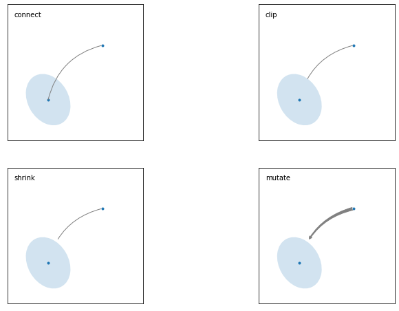
arrowstyle关键字,以上关键字就不能使用。允许的值有:箭头的样式 属性 '-'None '->'head_length=0.4,head_width=0.2 '-['widthB=1.0,lengthB=0.2,angleB=None '|-|'widthA=1.0,widthB=1.0 '-|>'head_length=0.4,head_width=0.2 '<-'head_length=0.4,head_width=0.2 '<->'head_length=0.4,head_width=0.2 '<|-'head_length=0.4,head_width=0.2 '<|-|>'head_length=0.4,head_width=0.2 'fancy'head_length=0.4,head_width=0.4,tail_width=0.4 'simple'head_length=0.5,head_width=0.5,tail_width=0.2 下图展现了不同的
arrowstyle的不同形式: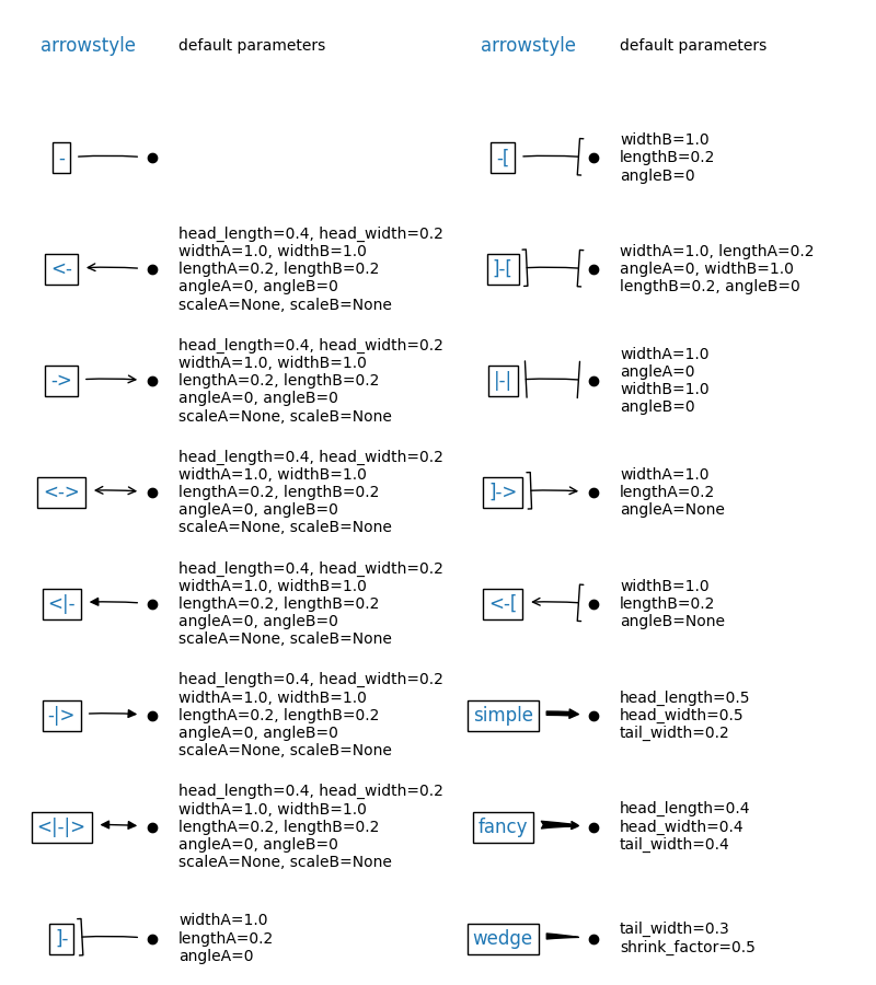
FancyArrowPatch的关键字包括:
Key Description arrowstyle 箭头的样式 connectionstyle 连接线的样式 relpos 箭头起始点相对注释文本的位置,默认为 (0.5, 0.5),即文本的中心,(0,0)表示左下角,(1,1)表示右上角 patchA 箭头起点处的图形(matplotlib.patches对象),默认是注释文字框 patchB 箭头终点处的图形(matplotlib.patches对象),默认为空 shrinkA 箭头起点的缩进点数,默认为2 shrinkB 箭头终点的缩进点数,默认为2 mutation_scale default is text size (in points) mutation_aspect default is 1. ? any key for matplotlib.patches.PathPatch annotation_clip: 布尔值,可选参数,默认为空。设为True时,只有被注释点在axes时才绘制注释;设为False时,无论被注释点在哪里都绘制注释。仅当xycoords为data时,默认值空相当于True。1
2
3
4
5
6
7
8
9
10
11
12
13
14
15
16
17
18
19
20
21
22
23
24
25
26
27
28
29
30
31
32
33
34
35
36
37
38
39
40
41
42
43
44
45
46
47
48
49
50
51
52
53
54
55
56
57
58
59
60
61
62
63
64
65
66
67
68
69
70
71
72
73
74
75
76#此代码主要给示范了不同的arrowstyle以及FancyArrowPatch的样式
import matplotlib.pyplot as plt
import matplotlib.patches as mpatches
fig, axs = plt.subplots(2, 2, figsize = (12, 8))
x1, y1 = 0.3, 0.3
x2, y2 = 0.7, 0.7
ax = axs.flat[0]
ax.plot([x1, x2], [y1, y2], ".")
el = mpatches.Ellipse((x1, y1), 0.3, 0.4, angle=30, alpha=0.2)
ax.add_artist(el)#在axes中创建一个artist
ax.annotate("",
xy=(x1, y1), xycoords='data',
xytext=(x2, y2), textcoords='data',
arrowprops=dict(arrowstyle="-",#箭头的样式
color="0.5",
patchB=None,
shrinkB=0,
connectionstyle="arc3,rad=0.3",
),
)
#在整个代码中使用Transform=ax.transAx表示坐标相对于axes的bounding box,其中(0,0)是轴的左下角,(1,1)是右上角。
ax.text(.05, .95, "connect", transform=ax.transAxes, ha="left", va="top")
ax = axs.flat[1]
ax.plot([x1, x2], [y1, y2], ".")
el = mpatches.Ellipse((x1, y1), 0.3, 0.4, angle=30, alpha=0.2)
ax.add_artist(el)
ax.annotate("",
xy=(x1, y1), xycoords='data',
xytext=(x2, y2), textcoords='data',
arrowprops=dict(arrowstyle="-",
color="0.5",
patchB=el,#箭头终点处的图形
shrinkB=0,
connectionstyle="arc3,rad=0.3",
),
)
ax.text(.05, .95, "clip", transform=ax.transAxes, ha="left", va="top")
ax = axs.flat[2]
ax.plot([x1, x2], [y1, y2], ".")
el = mpatches.Ellipse((x1, y1), 0.3, 0.4, angle=30, alpha=0.2)
ax.add_artist(el)
ax.annotate("",
xy=(x1, y1), xycoords='data',
xytext=(x2, y2), textcoords='data',
arrowprops=dict(arrowstyle="-",
color="0.5",
patchB=el,
shrinkB=5,
connectionstyle="arc3,rad=0.3",
),
)
ax.text(.05, .95, "shrink", transform=ax.transAxes, ha="left", va="top")
ax = axs.flat[3]
ax.plot([x1, x2], [y1, y2], ".")
el = mpatches.Ellipse((x1, y1), 0.3, 0.4, angle=30, alpha=0.2)
ax.add_artist(el)
ax.annotate("",
xy=(x1, y1), xycoords='data',
xytext=(x2, y2), textcoords='data',
arrowprops=dict(arrowstyle="fancy",
color="0.5",
patchB=el,
shrinkB=5,#箭头终点的缩进点数
connectionstyle="arc3,rad=0.3",
),
)
ax.text(.05, .95, "mutate", transform=ax.transAxes, ha="left", va="top")
for ax in axs.flat:
ax.set(xlim=(0, 1), ylim=(0, 1), xticks=[], yticks=[], aspect=1)
plt.show()Results:
两个点之间的连线
两个点之间的连接路径主要有
connectionstyle和以下样式确定Name Attrs angle angleA=90,angleB=0,rad=0.0 angle3 angleA=90,angleB=0 arc angleA=0,angleB=0,armA=None,armB=None,rad=0.0 arc3 rad=0.0 bar armA=0.0,armB=0.0,fraction=0.3,angle=None 其中
angle3和arc3中的3意味着所得到的路径是二次样条段( 三个控制点)。下面的例子丰富的展现了连接线的用法,可以参考学习:1
2
3
4
5
6
7
8
9
10
11
12
13
14
15
16
17
18
19
20
21
22
23
24
25
26
27
28
29
30
31
32
33
34
35
36
37
38
39
40import matplotlib.pyplot as plt
def demo_con_style(ax, connectionstyle):
x1, y1 = 0.3, 0.2
x2, y2 = 0.8, 0.6
ax.plot([x1, x2], [y1, y2], ".")
ax.annotate("",
xy=(x1, y1), xycoords='data',
xytext=(x2, y2), textcoords='data',
arrowprops=dict(arrowstyle="->", color="0.5",
shrinkA=5, shrinkB=5,
patchA=None, patchB=None,
connectionstyle=connectionstyle,
),
)
ax.text(.05, .95, connectionstyle.replace(",", ",\n"),
transform=ax.transAxes, ha="left", va="top")
fig, axs = plt.subplots(3, 5, figsize=(12, 8))
demo_con_style(axs[0, 0], "angle3,angleA=90,angleB=0")
demo_con_style(axs[1, 0], "angle3,angleA=0,angleB=90")
demo_con_style(axs[0, 1], "arc3,rad=0.")
demo_con_style(axs[1, 1], "arc3,rad=0.3")
demo_con_style(axs[2, 1], "arc3,rad=-0.3")
demo_con_style(axs[0, 2], "angle,angleA=-90,angleB=180,rad=0")
demo_con_style(axs[1, 2], "angle,angleA=-90,angleB=180,rad=5")
demo_con_style(axs[2, 2], "angle,angleA=-90,angleB=10,rad=5")
demo_con_style(axs[0, 3], "arc,angleA=-90,angleB=0,armA=30,armB=30,rad=0")
demo_con_style(axs[1, 3], "arc,angleA=-90,angleB=0,armA=30,armB=30,rad=5")
demo_con_style(axs[2, 3], "arc,angleA=-90,angleB=0,armA=0,armB=40,rad=0")
demo_con_style(axs[0, 4], "bar,fraction=0.3")
demo_con_style(axs[1, 4], "bar,fraction=-0.3")
demo_con_style(axs[2, 4], "bar,angle=180,fraction=-0.2")
for ax in axs.flat:
ax.set(xlim=(0, 1), ylim=(0, 1), xticks=[], yticks=[], aspect=1)
fig.tight_layout(pad=0.2)
plt.show()Results:

kwargs:该参数接受任何
Text的参数
详细的参数介绍可以参考我之前的博客 Matplotlib 的 3.2 节 标注点的绘制。 annotate的参数非常复杂,这里仅仅展示两个简单的例子,更多参数可以查看官方文档中的annotate介绍
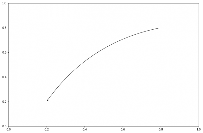
A simple case
1
2
3
4
5
6
7fig = plt.figure()
ax = fig.add_subplot()
ax.annotate("",
xy=(0.2, 0.2), xycoords='data',
xytext=(0.8, 0.8), textcoords='data',
arrowprops=dict(arrowstyle="->", connectionstyle="arc3,rad=0.2")
);Results:
A complex case
1
2
3
4
5
6
7
8
9
10
11
12
13
14
15
16
17
18
19
20
21
22
23
24
25
26
27
28
29import matplotlib.pyplot as plt
import numpy as np
plt.rcParams['font.sans-serif'] = ['SimHei']
plt.rcParams['axes.unicode_minus'] = False
fig = plt.figure(figsize = (12, 8))
# 在 Figure 对象中创建一个 Axes 对象,每个 Axes 对象即为一个绘图区域
ax = fig.add_subplot(111)
x = np.arange(10, 20)
y = np.around(np.log(x), 2)
ax.plot(x, y, marker = 'o')
ax.annotate(u'样式1', xy = (x[1], y[1]), xytext = (80, 10), textcoords = 'offset points',
arrowprops = dict(arrowstyle = '->', connectionstyle = 'angle3, angleA = 80, angleB = 50'))
ax.annotate(u'样式2', xy = (x[3], y[3]), xytext = (80, 10), textcoords = 'offset points',
arrowprops = dict(facecolor = 'black', shrink = 0.05, width = 5))
ax.annotate(u'样式3', xy = (x[5], y[5]), xytext = (80, 10), textcoords = 'offset points',
arrowprops = dict(facecolor = 'green', headwidth = 5, headlength = 10),
bbox = dict(boxstyle = 'circle, pad = 0.5', fc = 'yellow', ec = 'k', lw = 1, alpha = 0.5))
# fc: facecolor, ec: edegcolor, lw: lineweight
ax.annotate(u'样式4', xy = (x[7], y[7]), xytext = (80, 10), textcoords = 'offset points',
arrowprops = dict(facecolor = 'blue', headwidth = 5, headlength = 10),
bbox = dict(boxstyle = 'round, pad = 0.5', fc = 'gray', ec = 'k', lw = 1, alpha = 0.5))
plt.show()Results:

以下两个 block 懂了之后,annotate
基本懂了。如果想更深入学习可以参看[]官网案例学习](https://matplotlib.org/api/_as_gen/matplotlib.axes.Axes.annotate.html#matplotlib.axes.Axes.annotate)
More Case one
1
2
3
4
5
6
7
8
9
10
11
12
13
14
15
16
17
18
19
20
21
22
23
24
25
26
27
28
29
30
31
32
33
34
35
36
37
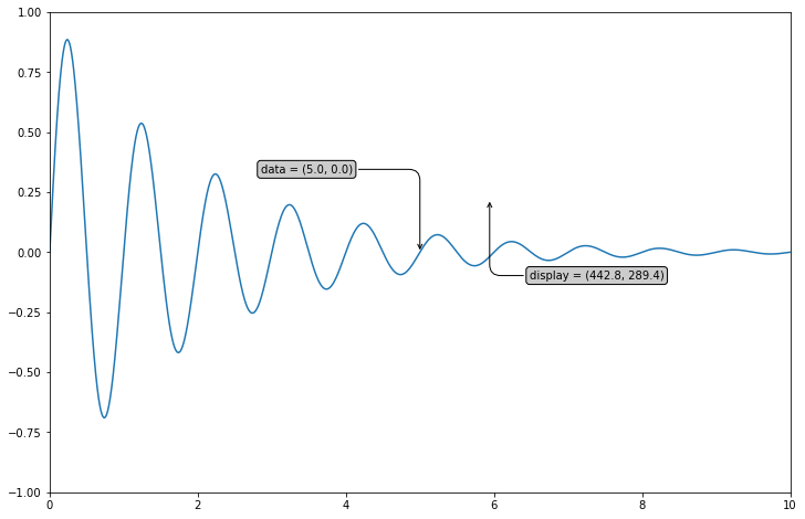
38import numpy as np
import matplotlib.pyplot as plt
# 以步长0.005绘制一个曲线
x = np.arange(0, 10, 0.005)
y = np.exp(-x/2.) * np.sin(2*np.pi*x)
fig, ax = plt.subplots(figsize = (12, 8))
ax.plot(x, y)
ax.set_xlim(0, 10)#设置x轴的范围
ax.set_ylim(-1, 1)#设置x轴的范围
# 被注释点的数据轴坐标和所在的像素
xdata, ydata = 5, 0
xdisplay, ydisplay = ax.transData.transform_point((xdata, ydata))
# 设置注释文本的样式和箭头的样式
bbox = dict(boxstyle="round", fc="0.8")
arrowprops = dict(
arrowstyle = "->",
connectionstyle = "angle,angleA=0,angleB=90,rad=10")
# 设置偏移量
offset = 72
# xycoords默认为'data'数据轴坐标,对坐标点(5,0)添加注释
# 注释文本参考被注释点设置偏移量,向左2*72points,向上72points
ax.annotate('data = (%.1f, %.1f)'%(xdata, ydata),
(xdata, ydata), xytext=(-2*offset, offset), textcoords='offset points',
bbox=bbox, arrowprops=arrowprops)
# xycoords以绘图区左下角为参考,单位为像素
# 注释文本参考被注释点设置偏移量,向右0.5*72points,向下72points
disp = ax.annotate('display = (%.1f, %.1f)'%(xdisplay, ydisplay),
(xdisplay, ydisplay), xytext=(0.5*offset, -offset),
xycoords='figure pixels',
textcoords='offset points',
bbox=bbox, arrowprops=arrowprops)
plt.show()Results:
More Case two
1
2
3
4
5
6
7
8
9
10
11
12
13
14
15
16
17
18
19
20
21
22
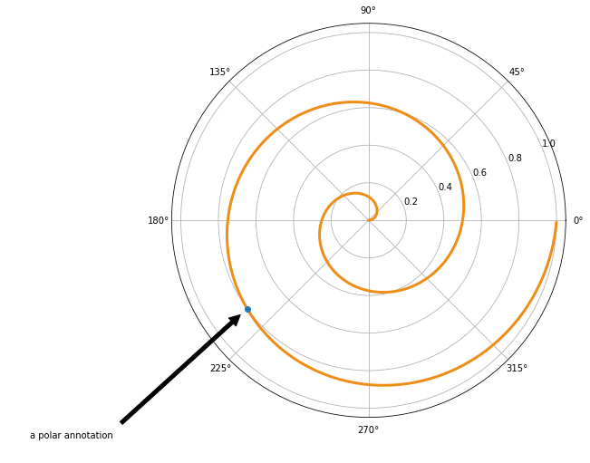
23import numpy as np
import matplotlib.pyplot as plt
# 绘制一个极地坐标,再以0.001为步长,画一条螺旋曲线
fig = plt.figure(figsize = (12, 8))
ax = fig.add_subplot(111, polar=True)
r = np.arange(0,1,0.001)
theta = 2 * 2*np.pi * r
line, = ax.plot(theta, r, color='#ee8d18', lw=3)
# 对索引为800处画一个圆点,并做注释
ind = 800
thisr, thistheta = r[ind], theta[ind]
ax.plot([thistheta], [thisr], 'o')
ax.annotate('a polar annotation',
xy=(thistheta, thisr), # 被注释点遵循极坐标系,坐标为角度和半径
xytext=(0.05, 0.05), # 注释文本放在绘图区的0.05百分比处
textcoords='figure fraction',
arrowprops=dict(facecolor='black', shrink=0.05),# 箭头线为黑色,两端缩进5%
horizontalalignment='left',# 注释文本的左端和低端对齐到指定位置
verticalalignment='bottom',
)
plt.show()
Results:
5.1.6 字体的属性设置
字体设置一般有全局字体设置和自定义局部字体设置两种方法。为方便在图中加入合适的字体,可以尝试了解中文字体的英文名称,该链接告诉了常用中文的英文名称:Here。
全局修改
1
2
3#该block讲述如何在matplotlib里面,修改字体默认属性,完成全局字体的更改。
plt.rcParams['font.sans-serif'] = ['SimSun'] # 指定默认字体为新宋体。
plt.rcParams['axes.unicode_minus'] = False # 解决保存图像时 负号'-' 显示为方块和报错的问题。局部修改
1
2
3
4
5
6
7
8
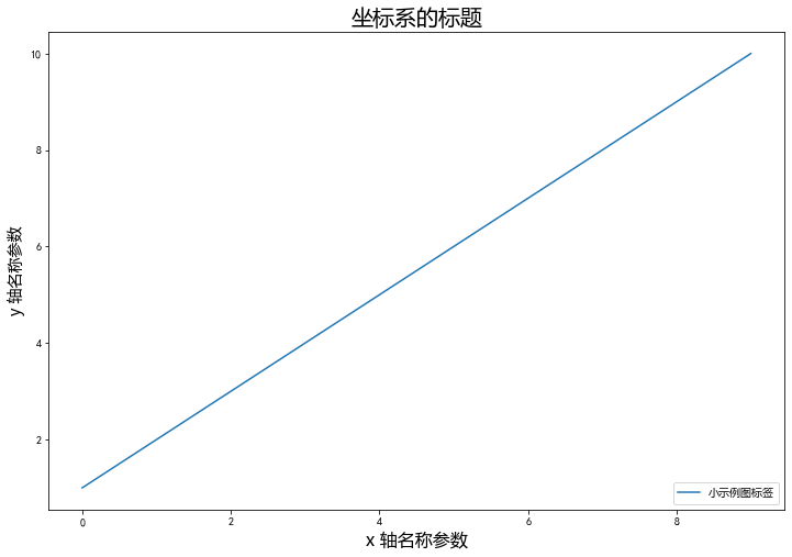
9#局部字体的修改方法1
x = [1, 2, 3, 4, 5, 6, 7, 8, 9, 10]
plt.plot(x, label='小示例图标签')
# 直接用字体的名字
plt.xlabel('x 轴名称参数', fontproperties='Microsoft YaHei', fontsize=16) # 设置x轴名称,采用微软雅黑字体
plt.ylabel('y 轴名称参数', fontproperties='Microsoft YaHei', fontsize=14) # 设置Y轴名称
plt.title('坐标系的标题', fontproperties='Microsoft YaHei', fontsize=20) # 设置坐标系标题的字体
plt.legend(loc='lower right', prop={"family": 'Microsoft YaHei'}, fontsize=10) ;Results:
5.2 Tick 上的文本
设置 tick(刻度)和
ticklabel(刻度标签)也是可视化中经常需要操作的步骤,matplotlib
既提供了自动生成刻度和刻度标签的模式(默认状态),同时也提供了许多灵活设置的方式。
5.2.1 Simple mode
可以使用 axis 的 set_ticks
方法手动设置标签位置,使用 axis 的
set_ticklabels 方法手动设置标签格式。例如:
set_ticks手动设置标签位置1
2
3
4
5
6
7x1 = np.linspace(0.0, 5.0, 100)
y1 = np.cos(2 * np.pi * x1) * np.exp(-x1)
fig, axs = plt.subplots(2, 1, figsize=(5, 3), tight_layout=True)
axs[0].plot(x1, y1)
axs[1].plot(x1, y1)
axs[1].xaxis.set_ticks(np.arange(0., 10.1, 2.));Results:
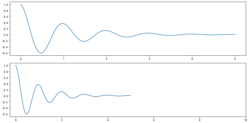
Note:使用
axis的set_ticks方法手动设置标签位置的例子,该案例中由于tick设置过大,所以会影响绘图美观,不建议用此方式进行设置tick。set_ticklabels手动设置标签格式1
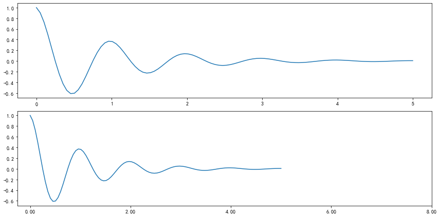
2
3
4
5
6
7fig, axs = plt.subplots(2, 1, figsize=(12, 6), tight_layout=True)
axs[0].plot(x1, y1)
axs[1].plot(x1, y1)
ticks = np.arange(0., 8.1, 2.)
tickla = [f'{tick:1.2f}' for tick in ticks]
axs[1].xaxis.set_ticks(ticks)
axs[1].xaxis.set_ticklabels(tickla);Results:
不更改刻度,直接修改刻度标签
一般绘图时会自动创建刻度,而如果通过上面的例子使用
set_ticks创建刻度可能会导致tick的范围与所绘制图形的范围不一致的问题。所以在下面的案例中,axs[1]中set_xtick的设置要与数据范围所对应,然后再通过set_xticklabels设置刻度所对应的标签。1
2
3
4
5
6
7
8
9
10
11
12
13
14
15import numpy as np
import matplotlib.pyplot as plt
fig, axs = plt.subplots(2, 1, figsize=(12, 6), tight_layout=True)
x1 = np.linspace(0.0, 6.0, 100)
y1 = np.cos(2 * np.pi * x1) * np.exp(-x1)
axs[0].plot(x1, y1)
axs[0].set_xticks([0,1,2,3,4,5,6])
axs[0].set_xticklabels([0,1,2,3,4,5,6], fontsize = 14)
axs[1].plot(x1, y1)
axs[1].set_xticks([0,1,2,3,4,5,6]) # 要将 x 轴的刻度放在数据范围中的哪些位置
axs[1].set_xticklabels(['zero','one', 'two', 'three', 'four', 'five','six'], # 设置刻度对应的标签
rotation=30, fontsize=14) # rotation选项设定 x 刻度标签倾斜30度。
axs[1].xaxis.set_ticks_position('bottom')# set_ticks_position()方法是用来设置刻度所在的位置,常用的参数有bottom、top、both、none
print(axs[1].xaxis.get_ticklines());Results:

5.2.2 Tick Locators and Formatters
除了上述的简单模式,还可以使用Tick Locators and Formatters完成对于刻度位置和刻度标签的设置。
其中 Axis.set_major_locator
和 Axis.set_minor_locator
方法用来设置标签的位置,Axis.set_major_formatter
和 Axis.set_minor_formatter方法用来设置标签的格式。这种方式的好处是不用显式地列举出刻度值列表。
set_major_formatter 和 set_minor_formatter
这两个 formatter
格式命令可以接收字符串格式(matplotlib.ticker.StrMethodFormatter)或函数参数(matplotlib.ticker.FuncFormatter)来设置刻度值的格式
。
Tick Formatters
FormatStrFormatter接收字符串1
2
3
4
5
6
7
8
9
10
11
12
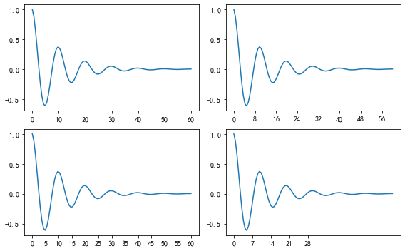
13# 接收字符串格式的例子
fig, axs = plt.subplots(2, 2, figsize=(8, 5), tight_layout=True)
for n, ax in enumerate(axs.flat):
ax.plot(x1*10., y1)
formatter = matplotlib.ticker.FormatStrFormatter('%1.1f')
axs[0, 1].xaxis.set_major_formatter(formatter)
formatter = matplotlib.ticker.FormatStrFormatter('-%1.1f')
axs[1, 0].xaxis.set_major_formatter(formatter)
formatter = matplotlib.ticker.FormatStrFormatter('%1.5f')
axs[1, 1].xaxis.set_major_formatter(formatter);Results:

FuncFormatter接收函数参数1
2
3
4
5
6
7
8
9
10def formatoddticks(x, pos):
"""Format odd tick positions."""
if x % 2:
return f'{x:1.2f}'
else:
return ''
fig, ax = plt.subplots(figsize=(5, 3), tight_layout=True)
ax.plot(x1, y1)
ax.xaxis.set_major_formatter(formatoddticks);Results:

Tick Locators
在普通的绘图中,我们可以直接通过上图的
set_ticks进行设置刻度的位置,缺点是需要自己指定或者接受matplotlib默认给定的刻度。当需要更改刻度的位置时,matplotlib给了常用的几种locator的类型。如果要绘制更复杂的图,可以先设置locator的类型,然后通过axs.xaxis.set_major_locator(locator)绘制即可。1
2
3
4
5
6locator=plt.MaxNLocator(nbins=7)
locator=plt.FixedLocator(locs=[0,0.5,1.5,2.5,3.5,4.5,5.5,6])#直接指定刻度所在的位置
locator=plt.AutoLocator()#自动分配刻度值的位置
locator=plt.IndexLocator(offset=0.5, base=1)#面元间距是1,从0.5开始
locator=plt.MultipleLocator(1.5)#将刻度的标签设置为1.5的倍数
locator=plt.LinearLocator(numticks=5)#线性划分5等分,4个刻度Case:
1
2
3
4
5
6
7
8
9
10
11
12
13
14
15fig, axs = plt.subplots(2, 2, figsize=(8, 5), tight_layout=True)
for n, ax in enumerate(axs.flat):
ax.plot(x1*10., y1)
locator = matplotlib.ticker.AutoLocator()
axs[0, 0].xaxis.set_major_locator(locator)
locator = matplotlib.ticker.MaxNLocator(nbins=10)
axs[0, 1].xaxis.set_major_locator(locator)
locator = matplotlib.ticker.MultipleLocator(5)
axs[1, 0].xaxis.set_major_locator(locator)
locator = matplotlib.ticker.FixedLocator([0,7,14,21,28])
axs[1, 1].xaxis.set_major_locator(locator);Results:
此外matplotlib.dates
模块还提供了特殊的设置日期型刻度格式和位置的方式:
1 | # 特殊的日期型locator和formatter |
Results:
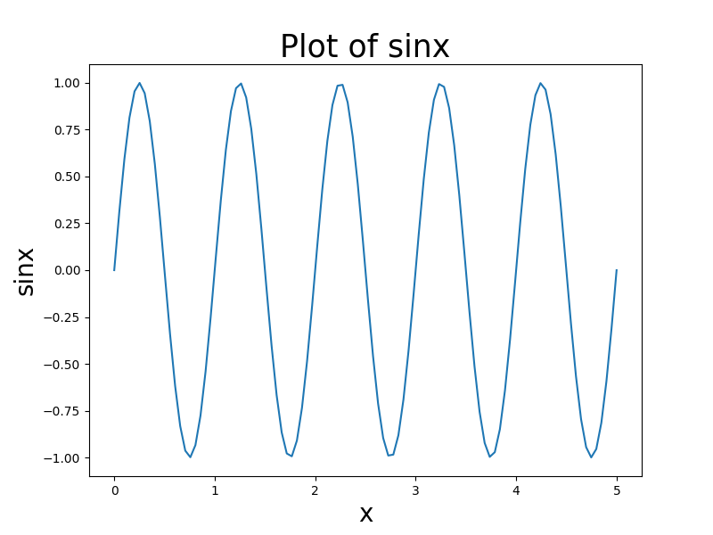
5.2.3 设置图形标题和坐标轴标签字体大小
Matplotlib 中标题和轴的大小和字体可以通过使用
set_size() 方法调整 fontsize 参数并更改
rcParams 字典的值来设置。本小节的内容参考博客 DelftStack
调整
fontsize参数以在Matplotlib中设置标题和轴的字体大小我们可以在标签和标题方法中调整字体大小参数的适当值,以在
Matplotlib中设置标签的字体大小和图表标题。1
2
3
4
5
6
7
8
9
10
11
12
13import numpy as np
import matplotlib.pyplot as plt
x=np.linspace(0,5,100)
y= np.sin(2 * np.pi * x)
fig = plt.figure(figsize=(8, 6))
plt.plot(x,y,)
plt.title('Plot of sinx', fontsize=25)
plt.xlabel('x', fontsize=20)
plt.ylabel('sinx', fontsize=20)
plt.show()Results:
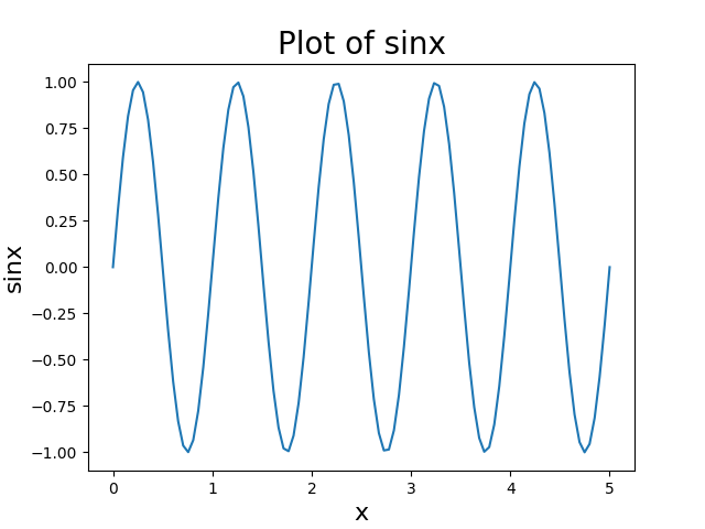
修改
rcParams字典的默认值可以更改存储在名为
matplotlib.rcParams的全局字典式变量中的默认rc设置,以设置Matplotlib中标签的字体大小和图表标题。rcParams的结构:可以通过
plt.rcParams.keys()函数获取rcParams键的完整列表。Table plt parameters
Keys Description axes.labelsize x 和 y 标签的字体大小 axes.titlesize 轴标题的字体大小 figure.titlesize 图形标题的大小(figure.suptitle()) xtick.labelsize 刻度标签的字体大小 ytick.labelsize 刻度标签的字体大小 legend.fontsize 图例的字体大小(plt.legend(),fig.legend()) legend.title_fontsize 图例标题的字体大小,无设置为默认轴。 1
2
3
4
5
6
7
8
9
10
11
12
13
14
15
16
17import numpy as np
import matplotlib.pyplot as plt
x=np.linspace(0,5,100)
y= np.sin(2 * np.pi * x)
parameters = {'axes.labelsize': 25,
'axes.titlesize': 35}
plt.rcParams.update(parameters)
fig = plt.figure(figsize=(8, 6))
plt.plot(x, y)
plt.title('Plot of sinx')
plt.xlabel('x')
plt.ylabel('sinx')
plt.show()Results:
set_size()方法在Matplotlib种设置标题和轴的字体大小首先,我们使用
get()方法返回绘图的轴。然后,使用axes.title.set_size(title_size),axes.xaxis.label.set_size(x_size)和axes.yaxis.label.set_size(y_size)来更改标题、x轴标签和y轴标签的字体大小。1
2
3
4
5
6
7
8
9
10
11
12
13
14
15
16
17import numpy as np
import matplotlib.pyplot as plt
x=np.linspace(0,5,100)
y= np.sin(2 * np.pi * x)
axes = plt.gca()
plt.plot(x, y)
axes.set_title('Plot of sinx')
axes.set_xlabel('x')
axes.set_ylabel('sinx')
axes.title.set_size(20)
axes.xaxis.label.set_size(16)
axes.yaxis.label.set_size(16)
plt.show()Results:
5.3 Legend
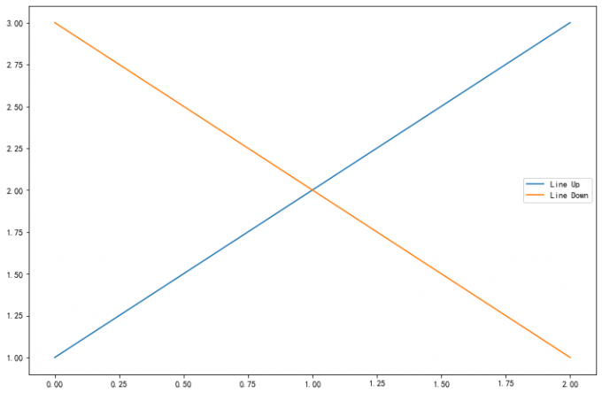
5.3.1 术语与概念
在具体学习图例之前,首先解释几个术语:
legend entry(图例条目)
每个图例由一个或多个
legend entries组成。一个entry包含一个key和其对应的label。legend key(图例键)
每个
legend label左面的colored/patterned marker(彩色/图案标记)legend label(图例标签)
描述由
key来表示的handle的文本legend handle(图例句柄)
用于在图例中生成适当图例条目的原始对象
以下面这个图为例,右侧的方框中的共有两个
legend entry;两个
legend key,分别是一个蓝色和一个黄色的
legend key;两个 legend label,一个名为
Line up 和一个名为 Line Down 的
legend label。
图例的绘制同样有 OO 模式和 pyplot
模式两种方式,写法都是一样的,使用 legend() 即可调用。
以下面的代码为例,在使用 legend
方法时,我们可以手动传入两个变量,句柄和标签,用以指定条目中的特定绘图对象和显示的标签值。当然通常更简单的操作是不传入任何参数,此时
matplotlib 会自动寻找合适的图例条目。
1 | fig, ax = plt.subplots() |
Results:
5.3.2 legend 的参数
参数:此方法接受以下描述的参数:
| keyword | Description |
|---|---|
| prop | the font property字体参数 |
| fontsize | the font size (used only if prop is not specified) |
| markerscale | the relative size of legend markers vs. original图例标记与原始标记的相对大小 |
| markerfirst | If True (default), marker is to left of the label.如果为True,则图例标记位于图例标签的左侧 |
| numpoints | the number of points in the legend for line为线条图图例条目创建的标记点数 |
| scatterpoints | the number of points in the legend for scatter plot为散点图图例条目创建的标记点数 |
| scatteryoffsets | a list of yoffsets for scatter symbols in legend为散点图图例条目创建的标记的垂直偏移量 |
| frameon | If True, draw the legend on a patch (frame).控制是否应在图例周围绘制框架 |
| fancybox | If True, draw the frame with a round fancybox.控制是否应在构成图例背景的FancyBboxPatch周围启用圆边 |
| shadow | If True, draw a shadow behind legend.控制是否在图例后面画一个阴 |
| framealpha | Transparency of the frame.控制图例框架的 Alpha 透明度 |
| edgecolor | Frame edgecolor. |
| facecolor | Frame facecolor. |
| ncol | number of columns 设置图例分为n列展示 |
| borderpad | the fractional whitespace inside the legend border图例边框的内边距 |
| labelspacing | the vertical space between the legend entries图例条目之间的垂直间距 |
| handlelength | the length of the legend handles 图例句柄的长度 |
| handleheight | the height of the legend handles 图例句柄的高度 |
| handletextpad | the pad between the legend handle and text 图例句柄和文本之间的间距 |
| borderaxespad | the pad between the axes and legend border轴与图例边框之间的距离 |
| columnspacing | the spacing between columns 列间距 |
| title | the legend title |
| bbox_to_anchor | the bbox that the legend will be anchored.指定图例在轴的位置 |
| bbox_transform | the transform for the bbox. transAxes if None. |
常用参数:
loc设置图例位置loc参数接收一个字符串或数字表示图例出现的位置。1
2
3ax.legend(loc='upper center')
# Equals to
ax.legend(loc=9)Table 3 Loc options
Location String Location Code 'best' 0 'upper right' 1 'upper left' 2 'lower left' 3 'lower right' 4 'right' 5 'center left' 6 'center right' 7 'lower center' 8 'upper center' 9 'center' 10 1
2
3
4
5fig,axes = plt.subplots(1,4,figsize=(10,4))
for i in range(4):
axes[i].plot([0.5],[0.5])
axes[i].legend(labels='a',loc=i) # 观察loc参数传入不同值时图例的位置
fig.tight_layout()Results:

设置图例边框及背景
1
2
3
4
5
6
7fig = plt.figure(figsize=(10,3))
axes = fig.subplots(1,3)
for i, ax in enumerate(axes):
ax.plot([1,2,3],label=f'ax {i}')
axes[0].legend(frameon=False) #去掉图例边框
axes[1].legend(edgecolor='blue') #设置图例边框颜色
axes[2].legend(facecolor='gray'); #设置图例背景颜色,若无边框,参数无效Results:

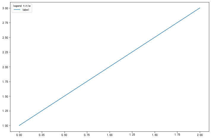
设置图例标题
1
2
3fig,ax =plt.subplots()
ax.plot([1,2,3],label='label')
ax.legend(title='legend title');Results:
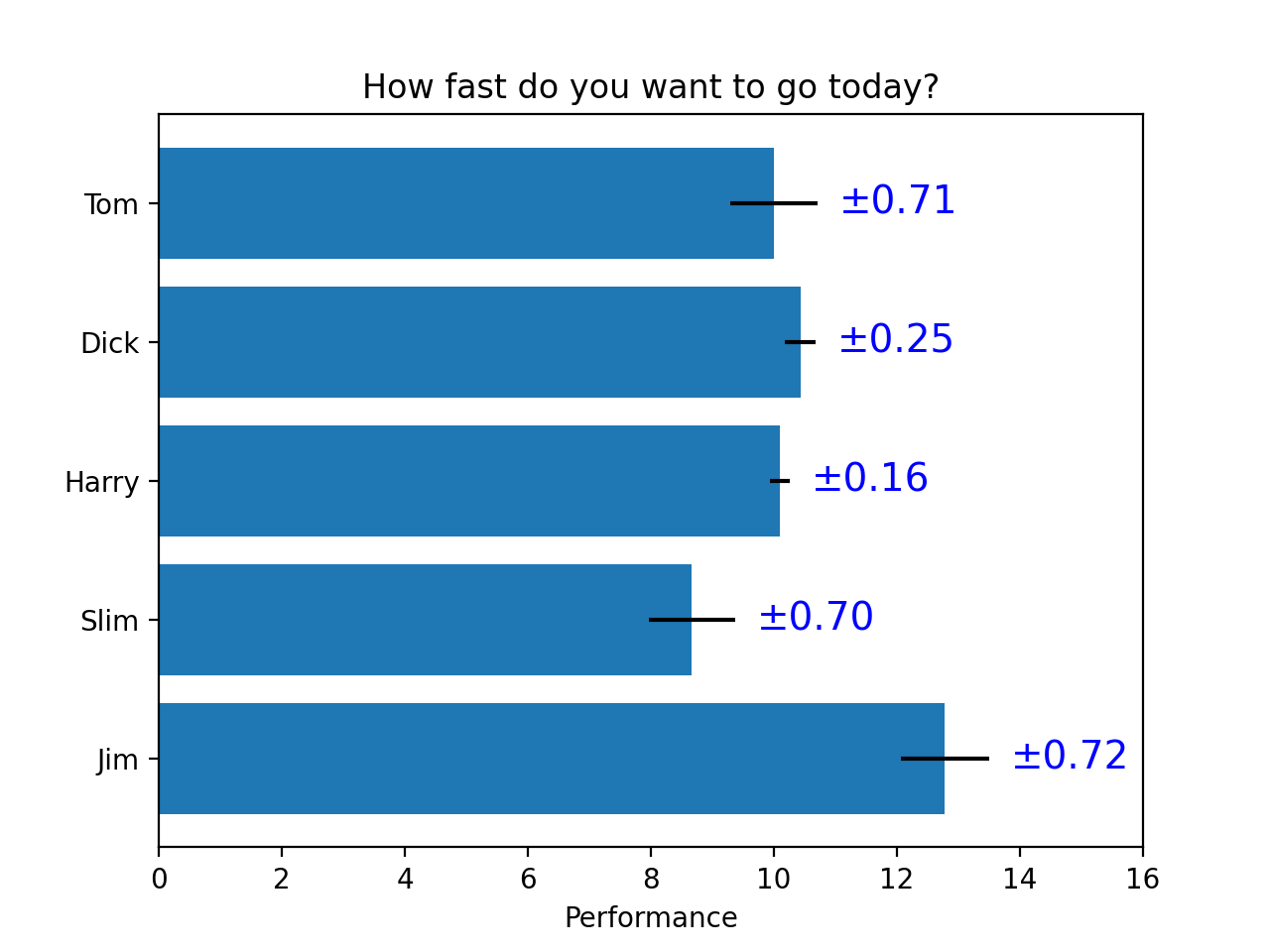
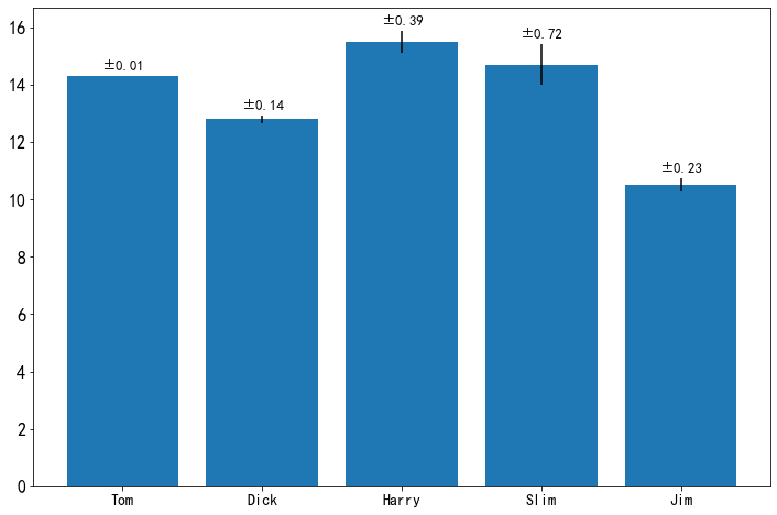
5.4 Thinking
请尝试使用两种方式模仿画出下面的图表(重点是柱状图上的标签),本文学习的text方法和matplotlib自带的柱状图标签方法bar_label
常规的竖向图
1
2
3
4
5
6
7
8
9
10
11
12
13
14
15
16
17
18
19
20
21import numpy as np
import matplotlib.pyplot as plt
names = ['Tom', 'Dick', 'Harry', 'Slim', 'Jim']
idx = np.arange(5)
values = 8 + 8*np.random.rand(1,5)
bias = np.random.rand(1, 5).round(2)[0]
values = values.round(1)[0]
fig = plt.figure(figsize = (12, 8))
ax = fig.add_subplot(111)
plt.bar(names, values, orientation = 'vertical', yerr = bias)
ax.set_xticklabels(names, fontsize = 14)
ax.xaxis.label.set_size(16)
ax.yaxis.label.set_size(16) # 设置坐标轴文字大小
for i in range(5):
ax.text(names[i], values[i] + bias[i] + 0.2, '±' + str(bias[i]), fontsize = 13, horizontalalignment = 'center')Results:
横向
1
2
3
4
5
6
7
8
9
10
11
12
13
14
15
16
17
18
19
20
21import numpy as np
import matplotlib.pyplot as plt
names = ['Tom', 'Dick', 'Harry', 'Slim', 'Jim']
idx = np.arange(5)
values = 8 + 8*np.random.rand(1,5)
bias = np.random.rand(1, 5).round(2)[0]
values = values.round(1)[0]
fig = plt.figure(figsize = (16, 8))
ax = fig.add_subplot(111)
plt.barh(names, values, xerr = bias)
ax.xaxis.label.set_size(16)
ax.yaxis.label.set_size(16)
ax.xaxis.set_ticks(np.arange(0, 20, 2));
for i in range(5):
ax.text(values[i] + bias[i] + 1, names[i], '±' + str(bias[i]), fontsize = 13, horizontalalignment = 'center')Results:

6. 样式色彩秀芳华
本章详细介绍 matplotlib
种样式和颜色的使用,绘图样式和颜色是丰富可视化图表的重要手段,因此熟练掌握本章可以让可视化图表变得更美观,突出重点和凸显艺术性。
关于绘图样式,常见的有 3 种方法: - 修改预定义样式; -
自定义样式; - rcParams;
关于颜色使用,本章将介绍常见的5种表示单色颜色的基本方法,以及colormap多色显示的方法。
6.1 Matplotlib
的绘图样式(style)
在 matplotlib
中,要想设置绘制样式,最简单的方法是在绘制元素时单独设置样式。
但是有时候,当用户在做专题报告时,往往会希望保持整体风格的统一而不用对每张图一张张修改,因此
matplotlib 库还提供了四种批量修改全局样式的方式。
6.1.1 matplotlib
预先定义样式
matplotlib
贴心地提供了许多内置的样式供用户操作,使用方式很简单,只需在
python 脚本的最开始输入想使用 style
的名称即可调用,尝试调用不同内置样式,比较区别。
Default
1
2
3
4
5
6
7import matplotlib as mpl
import matplotlib.pyplot as plt
import numpy as np
plt.rcParams['figure.figsize'] = (12 ,8)
plt.style.use('default')
plt.plot([1, 2, 3, 4], [2, 3, 4, 5])Results:
ggplot
1
2plt.style.use('ggplot')
plt.plot([1,2,3,4],[2,3,4,5])Results:
matplotlib 共内置了以下 26
种丰富的样式可供选择。
1 | print(plt.style.available) |
Results:
1 | ['Solarize_Light2', '_classic_test_patch', 'bmh', 'classic', 'dark_background', |
6.1.2 用户自定义
stylesheet
在任意路径下创建一个后缀名为 mplstyle
的样式清单,编辑文件添加以下样式内容:
axes.titlesize : 24
axes.labelsize : 20
lines.linewidth : 3
lines.markersize : 10
xtick.labelsize : 16
ytick.labelsize : 16
引用上述定义的 stylesheet 后观察图表变化:
1 | plt.style.use('./my.mplstyle') |
Results:
混合样式输入
值得特别注意的是,
matplotlib支持混合样式的引用,只需在引用时输入一个样式列表,若是几个样式中涉及到同一个参数,右边的样式表会覆盖左边的值。1
2plt.style.use(['dark_background', './my.mplstyle'])
plt.plot([1,2,3,4],[2,3,4,5])Results:
6.1.3 设置 rcparams
我们还可以通过修改默认 rc 设置的方式改变样式,所有
rc 设置都保存在一个叫做 matplotlib.rcParams
的变量中。修改过后再绘图,可以看到绘图样式发生了变化。
Default
1
2plt.style.use('default') # 恢复到默认样式
plt.plot([1,2,3,4],[2,3,4,5])Results:
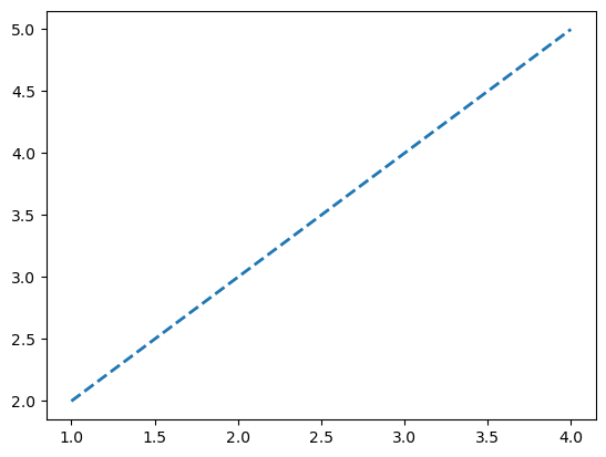
虚线形式
1
2
3mpl.rcParams['lines.linewidth'] = 2
mpl.rcParams['lines.linestyle'] = '--'
plt.plot([1,2,3,4],[2,3,4,5])Results:
一次性修改多个样式
1
2mpl.rc('lines', linewidth=4, linestyle='-.')
plt.plot([1,2,3,4],[2,3,4,5])Results:

6.2 Matplotlib color
setting
在可视化中,如何选择合适的颜色和搭配组合也是需要仔细考虑的,色彩选择要能够反映出可视化图像的主旨。从可视化编码的角度对颜色进行分析,可以将颜色分为 色相、亮度 和 饱和度 三个视觉通道。
- 色相: 没有明显的顺序性、一般不用来表达数据量的高低,而是用来表达数据列的类别。
- 明度和饱和度: 在视觉上很容易区分出优先级的高低、被用作表达顺序或者表达数据量视觉通道。
具体关于色彩理论部分的知识,可以参阅下列拓展材料进行学习。
在matplotlib中,设置颜色有以下几种方式:
RGBorRGBAHEX RGBorRGBA- 灰度色阶
- 单字符基本颜色
- 颜色名称
- 使用
colormap设置一组颜色
6.2.1 RGB or RGBA
RGBA 颜色用 [0,1]
之间的浮点数表示,四个分量按顺序分别为
(red, green, blue, alpha),其中 alpha
透明度可省略。
1 | plt.style.use('default') |
Results:
6.2.2 HEX RGB or
RGBA
HEX RGBA
用十六进制颜色码表示,同样最后两位表示透明度,可省略。
1 | plt.plot([1,2,3],[4,5,6],color='#0f0f0f') |
Results:
6.2.3 灰度色阶
当只有一个位于 [0,1] 的值时,表示灰度色阶。
1 | plt.plot([1,2,3],[4,5,6],color='0.5') |
Results:
6.2.4 单字符基本颜色
matplotlib
有八个基本颜色,可以用单字符串来表示,分别是:
| Character | Color |
|---|---|
'b' |
blue |
'g' |
green |
'r' |
red |
'c' |
cyan(蓝绿色) |
'm' |
magenta(品红) |
'y' |
yellow |
'k' |
black |
'w' |
white |
1 | plt.plot([1,2,3],[4,5,6],color='m') |
Results:
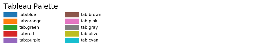
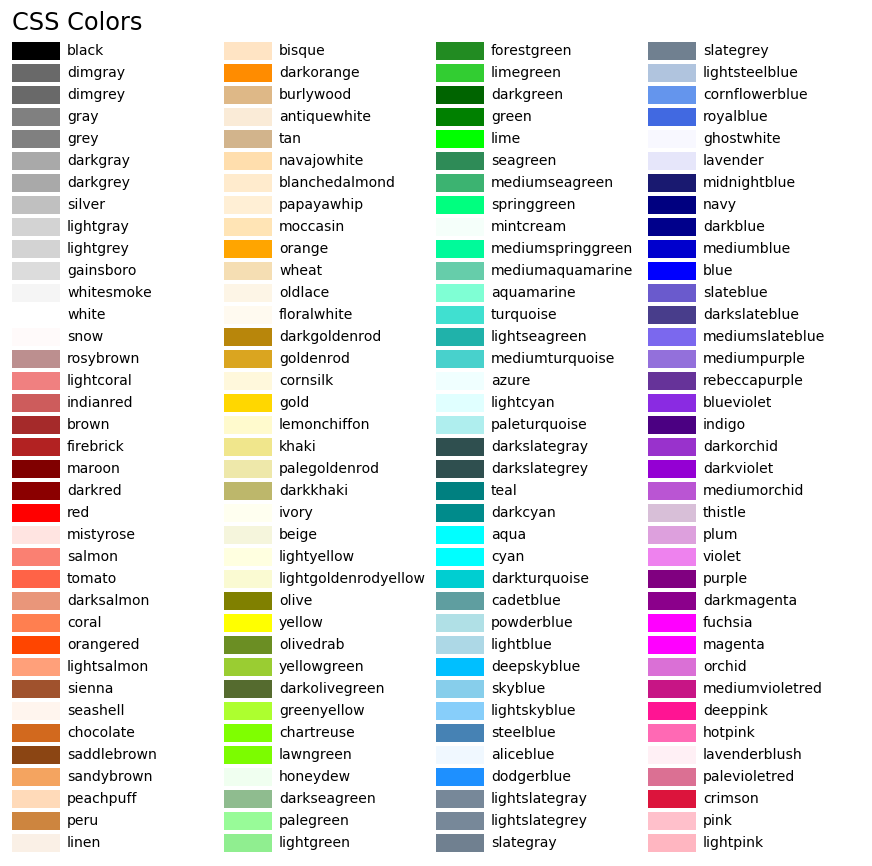
6.2.5 颜色名称
matplotlib
提供了颜色对照表,可供查询颜色对应的名称。
1 | plt.plot([1, 2, 3], [4, 5, 6], color = 'tan') |
Results:
6.2.6 使用 colormap
设置一组颜色
有些图表支持使用 colormap
的方式配置一组颜色,从而在可视化中通过色彩的变化表达更多信息。在
matplotlib 中,colormap 共有五种类型:
- 顺序(
Sequential)。通常使用单一色调,逐渐改变亮度和颜色渐渐增加,用于表示有顺序的信息 - 发散(
Diverging)。改变两种不同颜色的亮度和饱和度,这些颜色在中间以不饱和的颜色相遇;当绘制的信息具有关键中间值(例如地形)或数据偏离零时,应使用此值。 - 循环(
Cyclic)。改变两种不同颜色的亮度,在中间和开始/结束时以不饱和的颜色相遇。用于在端点处环绕的值,例如相角,风向或一天中的时间。 - 定性(
Qualitative)。常是杂色,用来表示没有排序或关系的信息。 - 杂色(
Miscellaneous)。一些在特定场景使用的杂色组合,如彩虹,海洋,地形等。
1 | x = np.random.randn(50) |
Results:
在以下官网页面可以查询上述五种colormap的字符串表示和颜色图的对应关系,Here